Leep Audio
A stage to compete on
Leep Audio is a Toronto-based music-tech startup on a mission to democratize artist development through social collaboration, AI-powered insights, and gamified engagement. As part of a five person UX/UI design team, my work centered on one objective, taking the competitions feature from an undefined concept to a structured, scalable product ready to launch.
What we delivered was a foundation: hi-fidelity screens and a component library built for consistency, designed to scale, and ready for Leep to build on as their platform grows.
The feature that didn’t exist yet
Leep's competitions feature existed as an idea more than a product.
The vision was there, a platform where emerging artists could submit tracks, remix existing ones, compete for real opportunities, and build an audience through community participation. But vision without structure isn't a product, it's a brief. There was no established user flow, no defined hierarchy between the artist, producer, and fan experience, and no visual language to hold it together. Without those foundations in place nothing could be built, tested, or scaled. Our job was to establish them.
Three users. One competition.
Every decision in the competition feature had to work across three distinct user types, the Artist, the Producer, and the Fan.
We defined these early and deliberately. Designing for one without considering the others would have created a feature that served part of the platform while quietly breaking the rest.
The Artist needed a clear path to submit and compete. The Producer needed a way to contribute technically without being treated as secondary. The Fan needed enough agency to feel like participation, not just consumption.
Getting the hierarchy between these three right wasn't a preliminary step. It was the design problem.

Artist
The primary user and the platform's reason for existing. Emerging musicians looking for more than a streaming number, they want feedback, exposure, and a real shot at being discovered. The competition feature is their stage.

Producer
The technical collaborator. Producers come to remix, contribute, and engage with the craft of music making. They're not passive participants — they're active contributors whose work shapes the competition entries everyone else listens to and votes on.
Fan
The community engine. Fans don't just listen — on Leep they have a stake in the outcome. Their vote carries weight, their feedback shapes what rises, and their participation is what turns a competition into a community event rather than just a contest.
Four flows mapped the full competitions experience
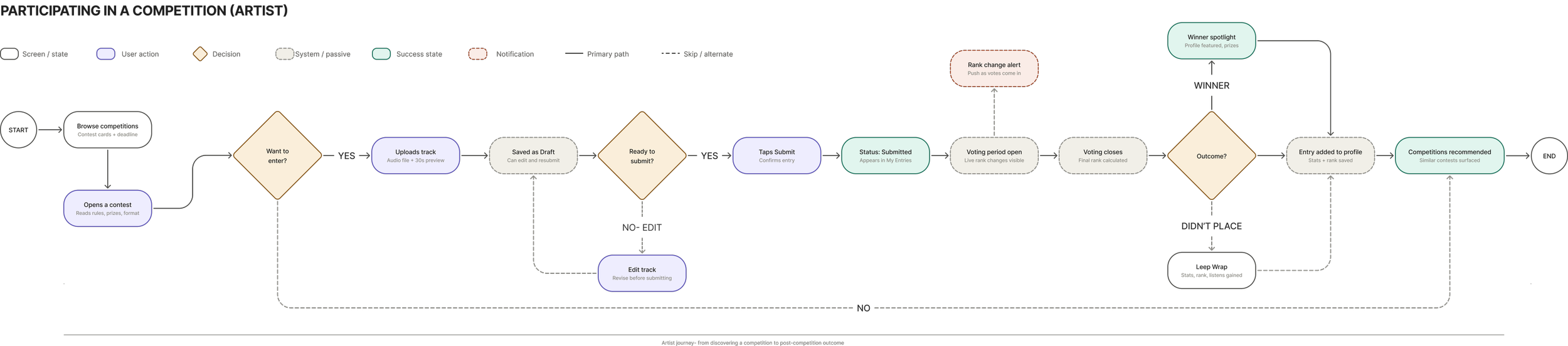
a first-time education tour that walks new users through the platform without overwhelming them, a complete participation journey covering submission, rank tracking, and post-competition outcome for both artists and producers, a fan voting experience gated behind a full listen to keep participation honest, and a global search flow that lets any user discover a competition from anywhere on the platform. Together they ensured that every user type had a clear path in, a reason to stay, and a reason to come back.
Looking before Leep-ing
Before designing for a space, you have to understand who is already living in it. Not to copy what existed, but to understand it.
Taking ownership of this research, I cast the net wide deliberately, direct competitors first, then indirect ones where the more unexpected insights came from.
SKIO Music and LabelRadar were both helping undiscovered artists get exposure, but through label-led models where the artist felt like a product and not the creative engine driving the platform.Neither was solving what Leep is solving.
Kaggle became the strongest structural reference for scalable competitions with dual leaderboards and clear lifecycle states. Splice showed how a livestream reveal could turn a result into an event. Dribbble Playoffs proved participation should have lasting value — win or lose. Discord showed that the conversation around a competition can be as valuable as the competition itself.
No single platform had cracked the combination of competition, community, and artist growth in one place, so we started there.

Music remix competition platform | industry model
Direct Competitor

Data science competition platform | strongest structural reference
Architecture

Music creation platform
| strongest engagement mechanics
Engagement

Design community | strongest participation model
Community

Communication platform | Community behavior standard
Communication
Mapping the territory
Before the screens, a map.
The sitemap organized the competitions experience into three core user journeys, Browse Competitions, My Competition Dashboard, and Results and Leaderboards. Each one serves a user at a different stage of the competition lifecycle. Browsing is discovery. The dashboard is ownership. Results are reflection.
Separating these three made the scope of the work visible to everyone, the client included.
The real brief
The first part was conversation.
We sat with the client and asked them to walk us through their vision for the competitions section, not the polished marketing-ready version, but the real one. The one that existed somewhere between intention and "this could work."
We needed to understand the parameters they were working within, what they were trying to achieve, and how they imagined a user moving through this part of the platform. These weren't brief exchanges. We were not just gathering requirements. We were learning how they thought.
"What makes Leap potentially a unique platform is all of these things working together — the collaboration, the feedback, the competition. That's the secret sauce."
— Client, CTO
Building fast, Thinking slower.
Armed with research and a clearer brief, we used AI to generate lo-fi wireframes. Not as a shortcut, but as a starting point.
This was a way of giving form to something that had until that point existed only in conversation. The AI got us to functional structure quickly. The team gave it meaning.
What followed were collaborative build sessions where every screen was questioned and reasoned through together. Five designers, each a check on the others. An assumption one person carried got questioned by another. That friction wasn't a problem to manage, it was the process working exactly as it should.
This approach mattered beyond our own workflow. The client builds his entire product using Lovable, an AI-powered development tool. Our design process and his development process were running in parallel, both AI-assisted, both human-directed. Understanding that shaped how we built and what we delivered.
Structure to screens
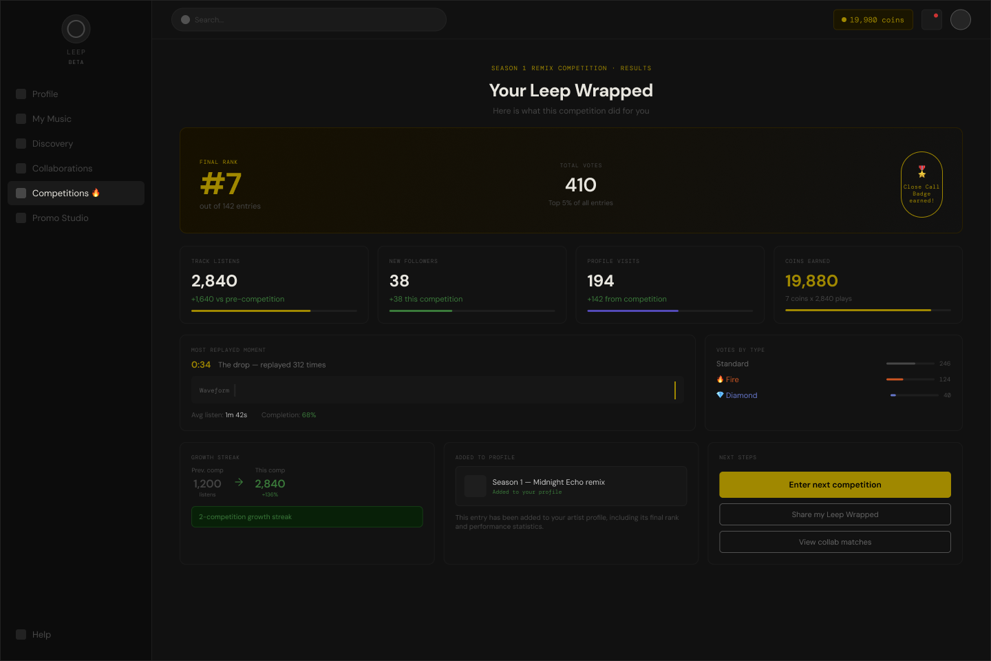
The first round of mid-fidelity screens gave the lo-fi wireframes visual weight and intent.
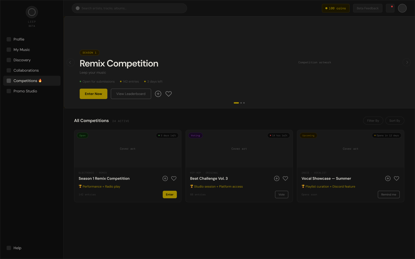
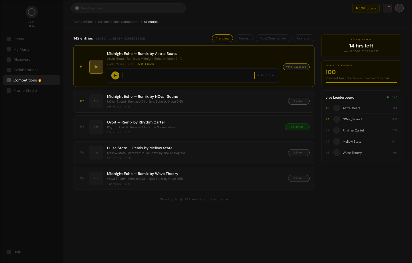
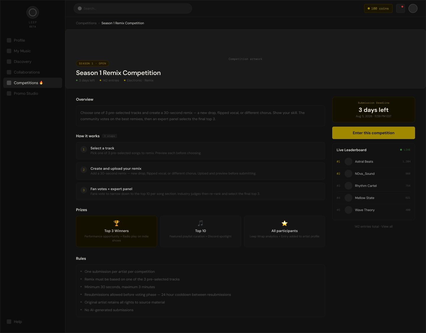
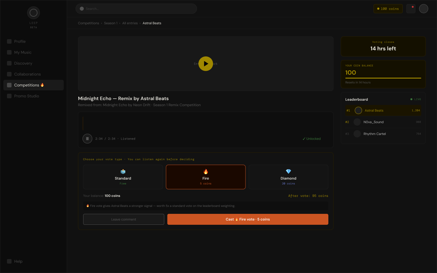
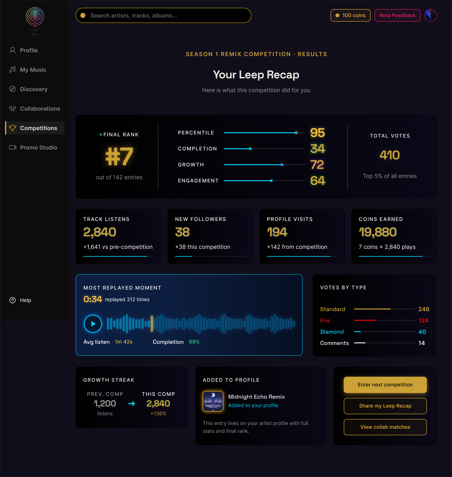
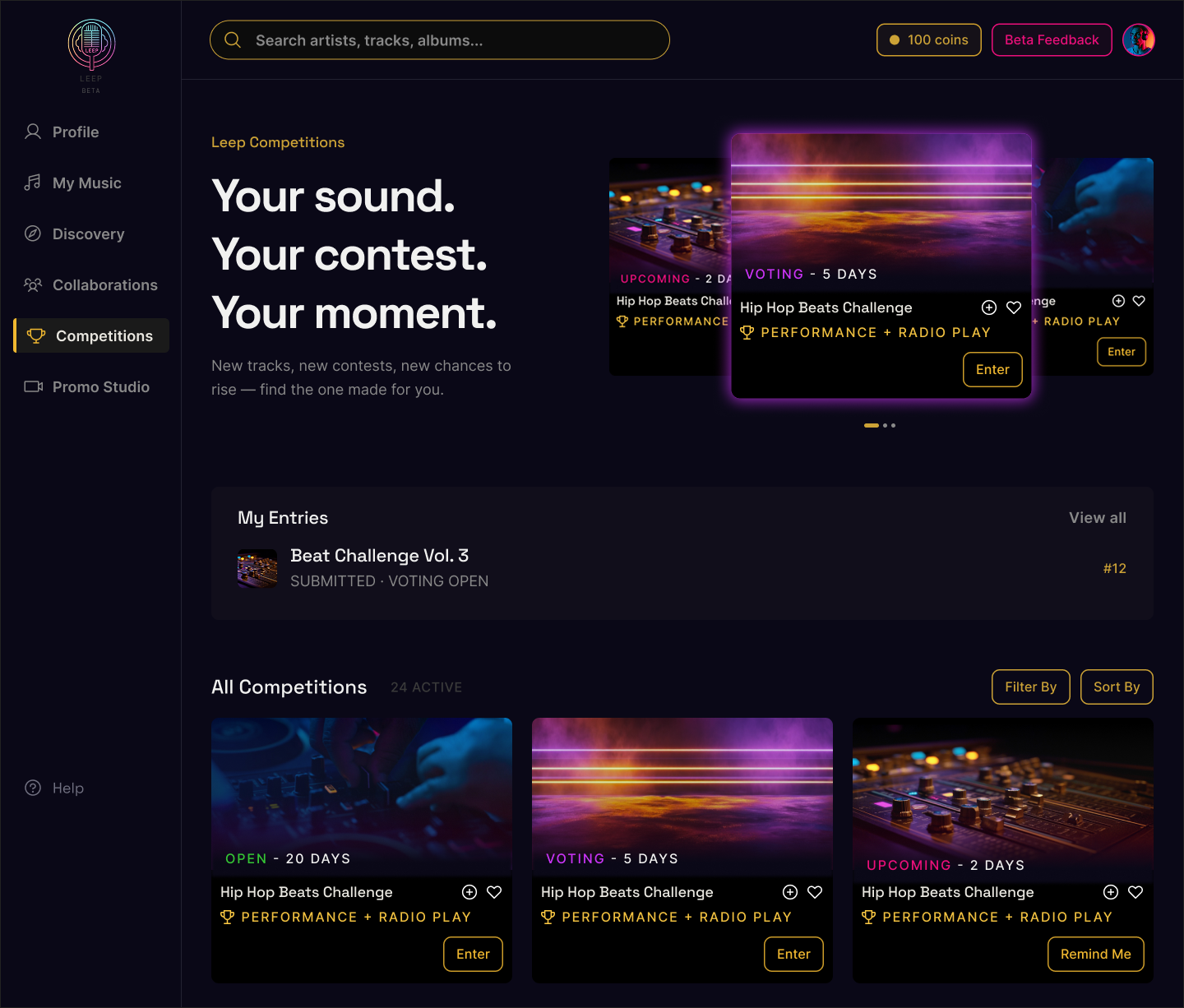
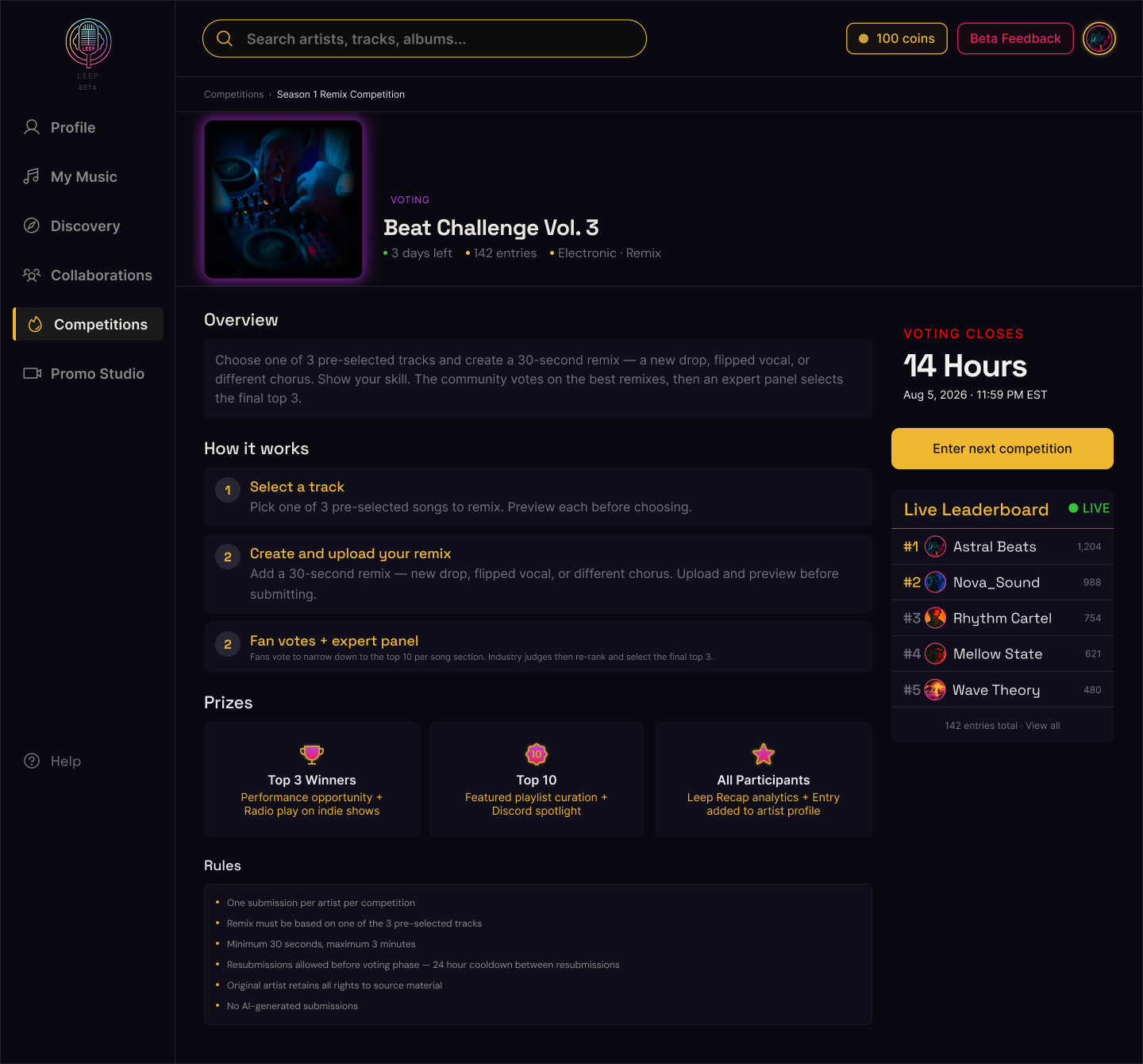
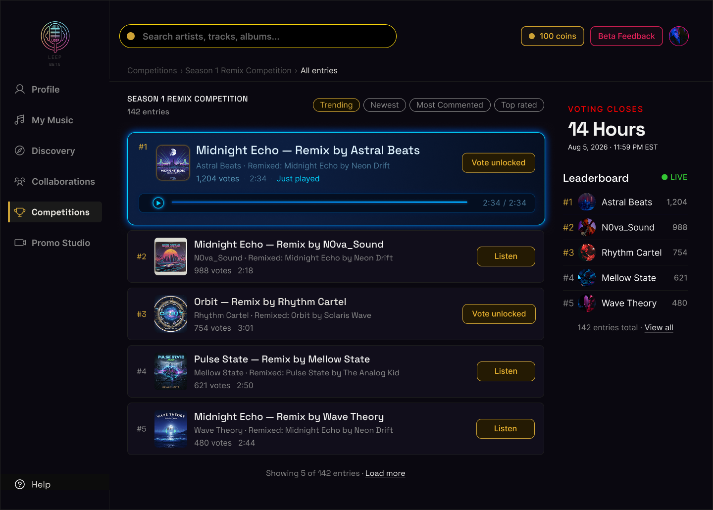
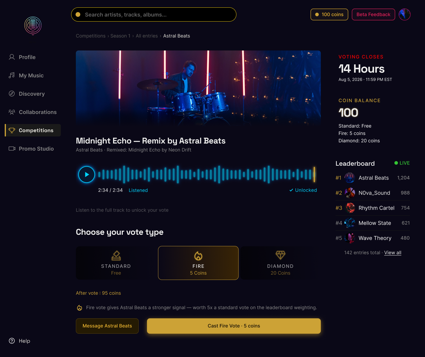
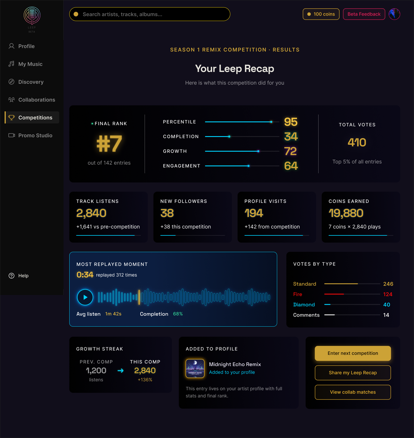
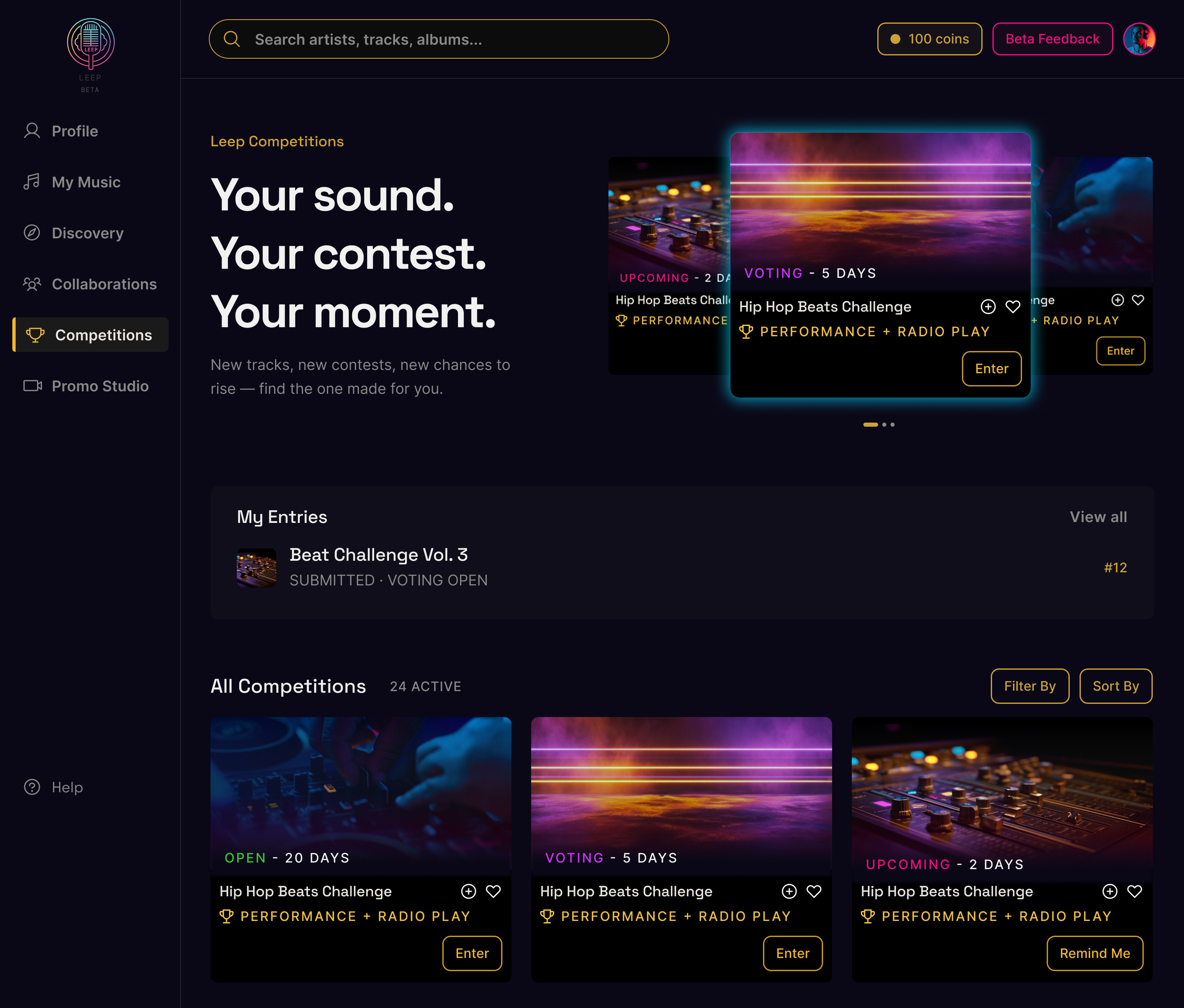
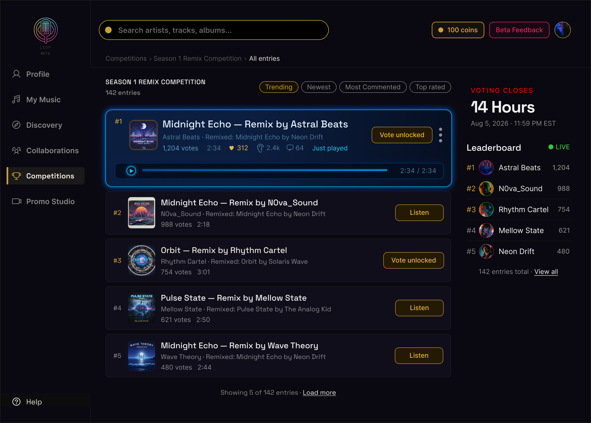
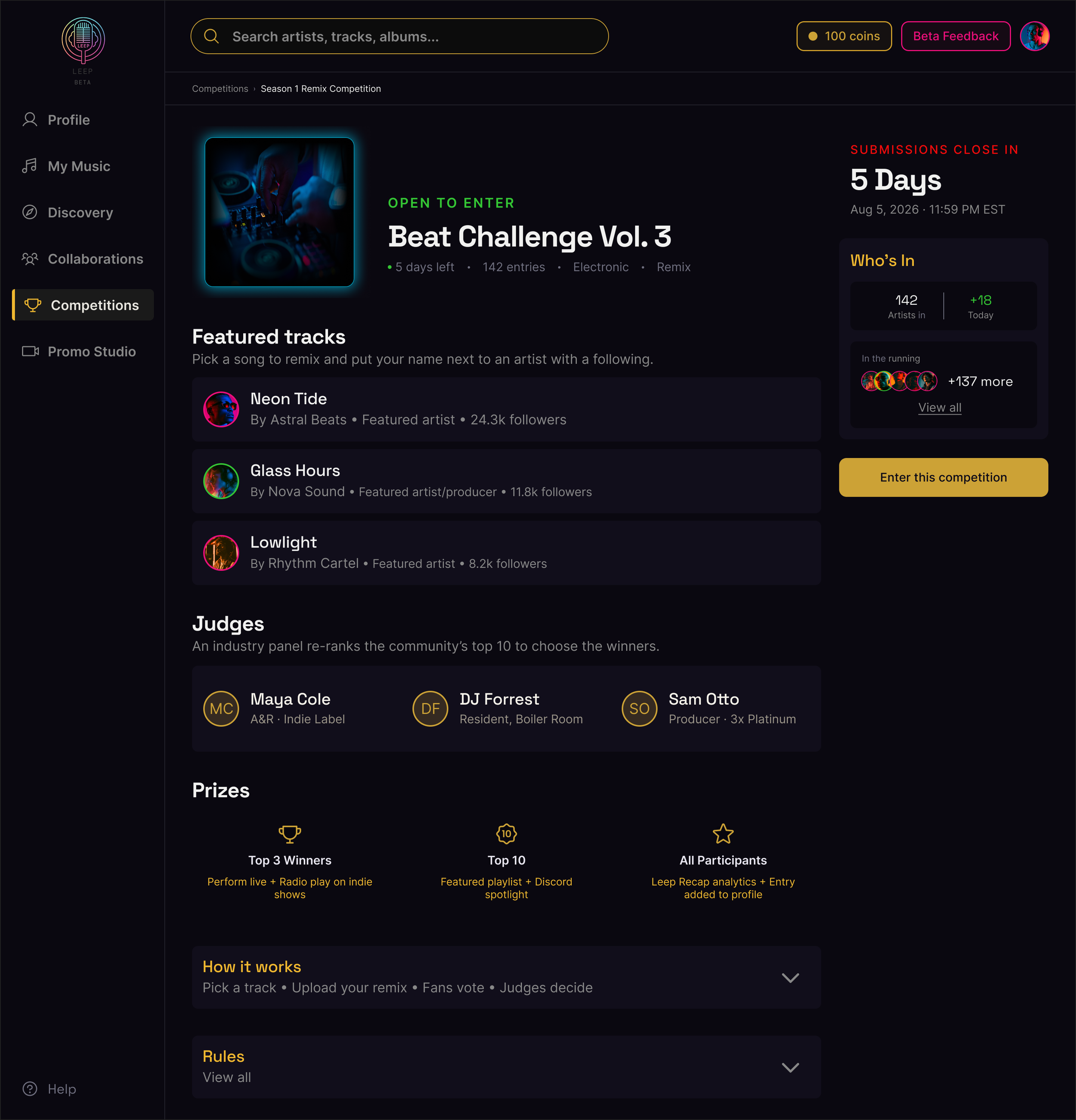
Each team member took ownership of a key screen (the competitions landing page, competition detail view, entries list, voting screen (my contribution), and Leep Recap) working independently before converging into one coherent vision.
Gold emerged as the primary accent color not arbitrarily but as a direct response to what the client had already tested and approved in his own development environment.
The dark surface system created depth and hierarchy. The sidebar, the countdown timer, the leaderboard panel, each one moved from structural placeholder to considered design decision.
Gold emerged as the primary accent color not arbitrarily but as a direct response to what the client had already tested and approved in his own development environment.
The dark surface system created depth and hierarchy. The sidebar, the countdown timer, the leaderboard panel, each one moved from structural placeholder to considered design decision.
What the client said
We presented the first round to the client. The direction was approved. But approval wasn't the most useful thing that came out of that meeting, specificity was.
01
"The color scheme is good. Gold accent for buttons — I like the button stylization."
— Client, CEO
Direction approved — visual language and gold as primary accent validated.
02
"I want to emphasize the judges and how many people are participating. More ways to persuade them."
— Client, CEO
Detail page — surface artists, judges, and scale before a user commits.
03
"People need to see where they put their remix and what they added."
— Client, CTO
Voting rethink — 30-second snippet format. A new competition type: the Showcase Competition.
Feedback into form
What the two versions produced wasn't just refined screens. It was proof that every change had a reason, and every reason had a source.
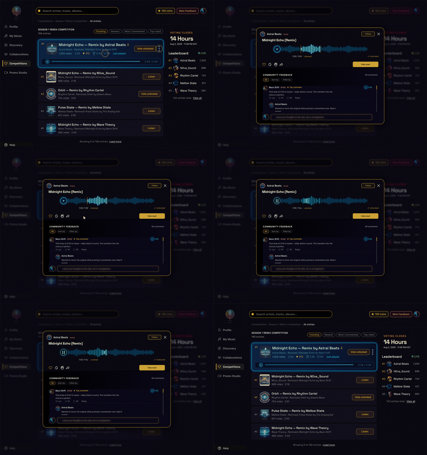
The voting screen was rebuilt around the 30-second snippet format, showing users exactly where in the original track the remix addition was placed. The Recap gained community signals and a competition-specific header. The community feedback layer was placed below the voting action, deliberately secondary, so the primary decision was never obscured, paired with a filter system to give users control over what they saw and how much of it.
From just screens, to product
Moving into hi-fidelity, the visual direction was set. What remained were the harder details, the ones that only surface once a system has to hold together end to end.
-
The comments section needed more work than expected. Our existing approach had gotten partway there but the structure wasn't resolved — and on a platform built around community feedback, that's not a minor detail. Further research into how other platforms handled community feedback alongside a primary action revealed the problem — the tagging system was too broad.
The solution was simpler than expected — a sort by and filter by system, utilitarian enough to sit wherever it was needed without demanding attention.
-
How to visually communicate user roles was a question that ran through the entire hi-fidelity process. Icons were explored first, microphone for artists, headphones for producers, star for fans. In practice they created visual noise at small sizes and became confusing in different contexts.
The team moved to color. Each role assigned a distinct value from the existing system, readable at any size, consistent across every screen.
-
If a user landed on a song page and decided it wasn't for them, there was no mechanism to keep moving.
We solved this by adding Previous and Skip to Next CTAs directly below the player, secondary in visual treatment so they wouldn't pull focus from someone ready to vote, but immediately reachable for someone who wasn't. -
A seemingly small detail that required real exploration. The 30-second showcase window needed to communicate clearly within the waveform — showing users exactly where in the original track the remix addition sat.
We explored five distinct approaches before landing on a solution: isolating just the 30-second segment as its own waveform, stripped of the surrounding track, so the focus stayed entirely on what the artist added. Context without noise.
Built in parallel
A design system was never a separate deliverable, it was built alongside every screen from the start.
That decision was deliberate. Building the system in isolation at the end would have meant retrofitting, going back through finished screens and hoping the decisions held together. Building it in parallel meant every component was tested in context as it was made.
Every color had a defined role. Gold as a primary accent. Blue for playback. Crimson, Neon, and Violet for competition states. Not arbitrary, each one earned its place through the screens it lived in. The typography system followed the same logic. Space Grotesk for display and UI. Inter for body and captions. Two fonts, clearly delineated, nothing overlapping.
Not Finished. Founded.
The competitions feature is ready to build from.
Leep is a platform built to grow. The visual language and structural logic established here are designed to scale alongside it.

Where it goes from here
A clickable prototype, usability testing, and secondary page build-out remain ahead. These were planned steps that the timeline didn't allow for, not abandoned ones. The design system and component library are in place to support them whenever the client is ready to take that next step.
The screens are built. The next step is connecting them — linking every decision point, every state, and every transition into a prototype that can be walked through end to end by a real user.
Clickable prototype across all five flows
Usability testing with artists, producers, and fans
Add information addressing MOQs, project size, and flexibility so buyers can self-qualify without needing to reach out first
Secondary page build-out
The competitions feature covers five key screens. The platform has more. With the design system and component library in place, the remaining pages can be built with consistency already established.
Collaborations page — full hi-fi screens
A first pass was delivered in the final week. It deserves a full one. The lo-fi wireframes and competitor research are in place — the hi-fi work is the natural next step.
One more thing… Collaborations
Out of scope until the final week — “it never really left the conversation" is the most honest account of how it actually played out. It was always there, just waiting its turn.
With the competitions feature resolved and the client satisfied with the direction, attention turned to the collaborations page, a section of the platform the client had flagged from the very first meeting as needing work but that had remained out of scope until now.
We didn't have time for full hi-fi. What we delivered was competitor research and lo-fi wireframes with the hi-fi style applied, enough visual coherence that the client could hand it directly to his development process and have a meaningful starting point. Not finished, but founded.
It was a small addition to a larger body of work. But it mattered, it meant the client left with momentum across two sections of the platform, not one.
Leep Audio is making the case that artist development doesn't belong behind closed doors. This project makes the case that the competitions feature is where that argument gets tested, where an unknown artist submits their first track, where a fan's vote actually means something, where a producer's remix finds an audience it never would have otherwise. The stage didn't exist. Now it does.
Meta Data
Leep Audio
Client
UX Research · UI Design
Role
5 Weeks
Timeline
Siddhant Hariani, Miriam Long, Gabi Reiss, Julia Spyra
Team
Figma, Figjam, Lovable, Claude, Gemini