Lasso Ethical Sourcing
Weaving trust into action
Lasso connects international brands, retailers, and designers with artisan communities across Latin America — managing sourcing, product development, production, and logistics while protecting fair trade and cultural integrity at every step.
The founders came with an open brief: sharpen the digital presence, clarify the offering, and tighten the operation. What the work actually needed to solve would come from the research.
5
/5
Contact confidence — every prototype testing participant rated their comfort reaching out at 4 or 5 out of 5
4.8
/5
Conversion intent score — the central goal of the feature, validated before a single line of high-fidelity code was written
4.8
/5
Homepage clarity score from lo/mid fidelity questionnaire — all participants correctly identified the primary audience
"I would feel very comfortable reaching out to start a project or ask a question."
— Prototype testing participant
"The clarity and confidence of this site makes me think they're really good at what they do."
— Prototype testing participant
Early conversations with founders helped frame the problem space.
Lasso's value proposition is inherently human, built on taste, relationships, and deep cultural knowledge that can't be reduced to a service menu.
The founders knew the brand was resonating aesthetically. What was less clear was whether the site was doing enough to move interested visitors toward action.Those conversations shaped the research direction. Rather than assuming a solution, the goal was to understand what buyers in Lasso's target market actually needed before feeling ready to engage, and whether the existing experience was delivering it.
What before who
Service clarity needed to come before brand storytelling — visitors couldn't connect with the mission if they didn't understand what was being offered
Pre-informed buyers
Founders wanted buyers to arrive at contact already informed, not needing to be educated over email
No process home
There was no dedicated space where a buyer could understand Lasso's end-to-end process before committing to a conversation
Aesthetics aren't enough
Trust was being built through aesthetics alone, without the operational transparency that sophisticated buyers needed to act
Understanding the landscape before defining the direction
No organization in this space fully combines service clarity, curatorial depth, operational transparency, and a buyer experience designed to convert interest into action. That gap defined Lasso's opportunity.
Research into direct competitors — Nest, By Hand Consulting, and AOW Handmade — revealed meaningful gaps across the board. Nest's scale and reach are strengths, but its complexity creates distance for buyers seeking practical guidance. By Hand Consulting is the closest in model to Lasso, though limited in visibility. AOW Handmade offers strong editorial aesthetics but feels disconnected from the communities it represents.
Indirect competitors including the Ethical Fashion Initiative and IBU Movement highlighted the gap between large-scale institutional infrastructure and direct-to-consumer storytelling.




The insight that shaped everything
Participants kept describing the same gap from their own sourcing experience: platforms that build interest but don't offer enough operational clarity to act. That insight shaped the design direction
Rather than testing the existing site directly, the first round of interviews focused on how buyers in Lasso's target market approach finding and vetting ethical suppliers in general.Five industry professionals, no prior exposure to the brand.
Participants responded warmly to the idea of a platform like Lasso — but when asked what would make them confident enough to reach out to an ethical supplier in general, the answers were consistently practical rather than emotional.
Production Manager
01
Needs to verify feasibility and process before championing a sourcing partner internally
Retail Buyer
02
Wants to gauge scale and minimum order quantities before starting a conversation
Treats a knowledgeable, named point of contact alongside a client history as trust signals
03
NGO, Vice President
Needs to verify feasibility and process before championing a sourcing partner internally
04
Fashion Designer
Sourcing Lead
05
Wants to gauge scale and minimum order quantities before starting a conversation
Wants to gauge scale and minimum order quantities before starting a conversation
↪
Common Thread
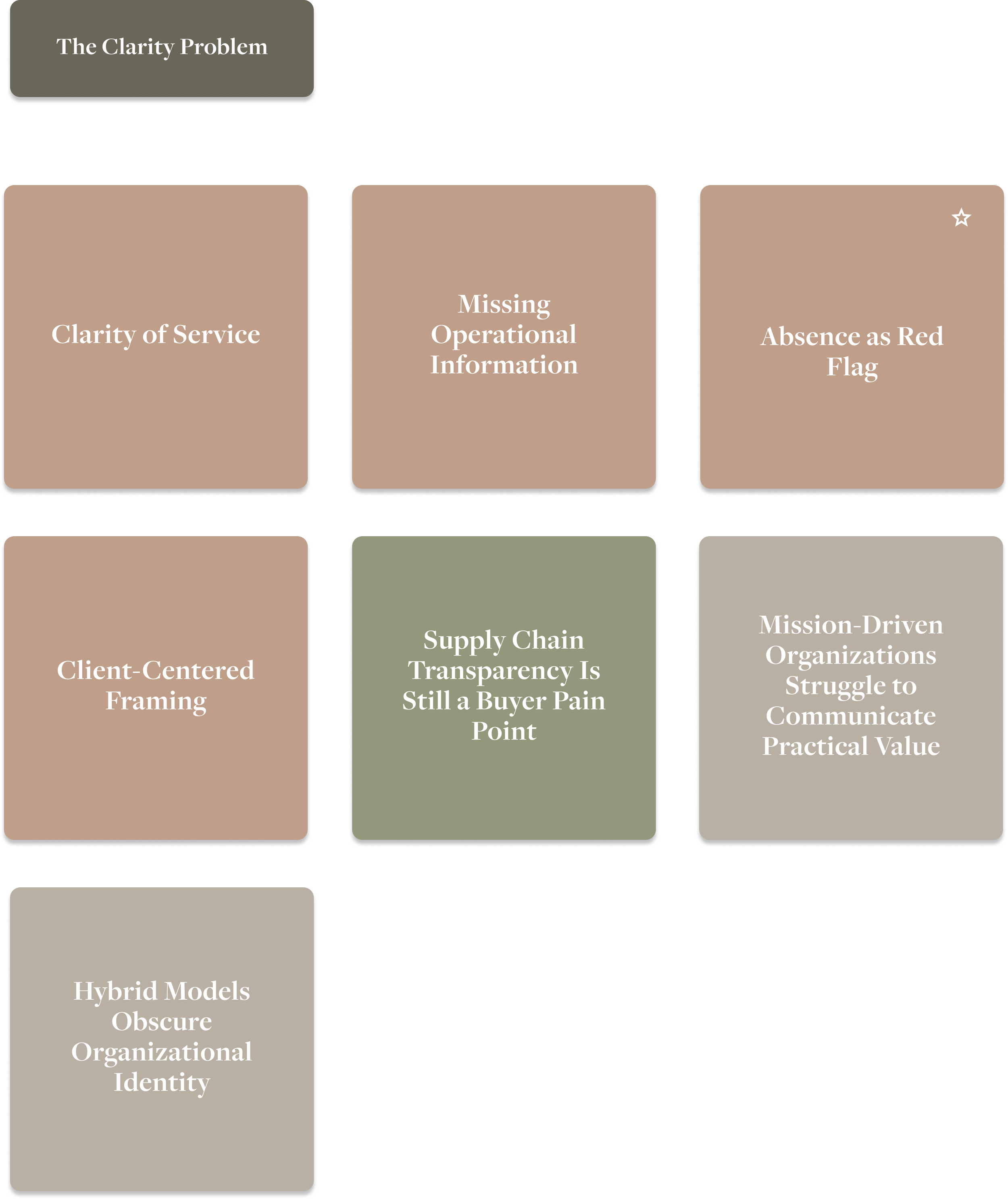
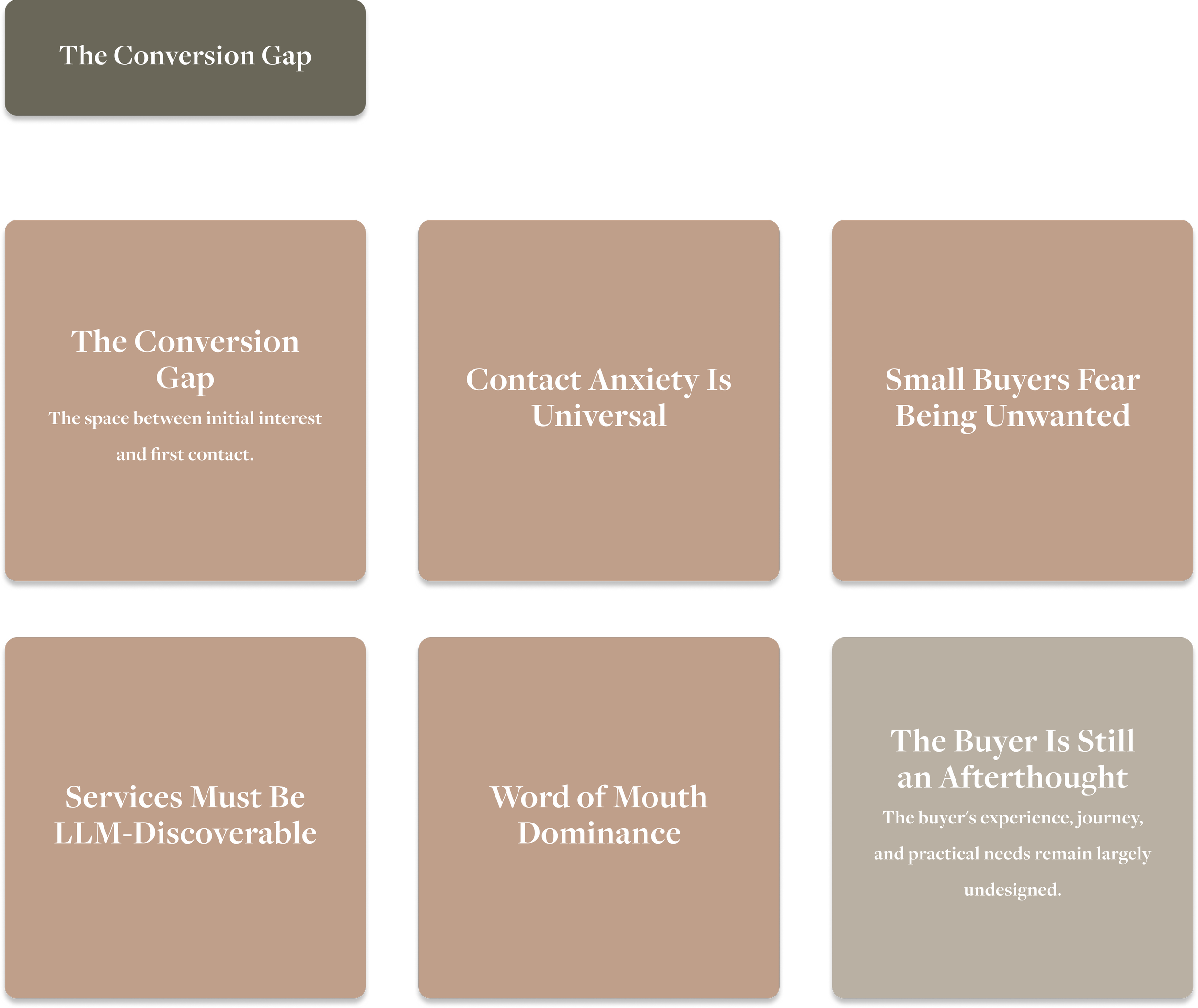
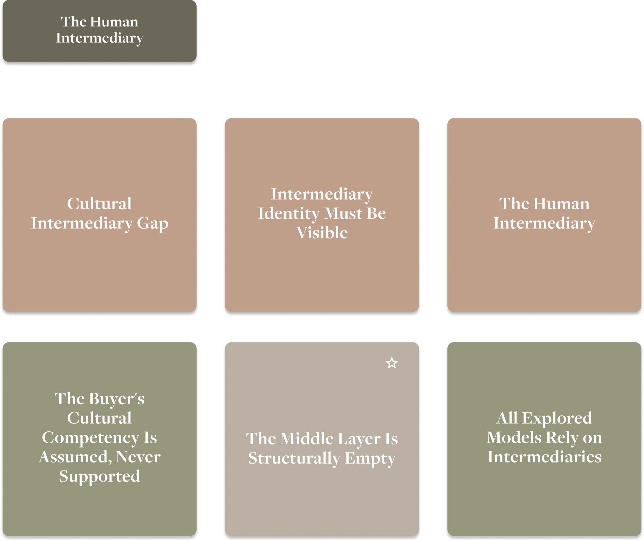
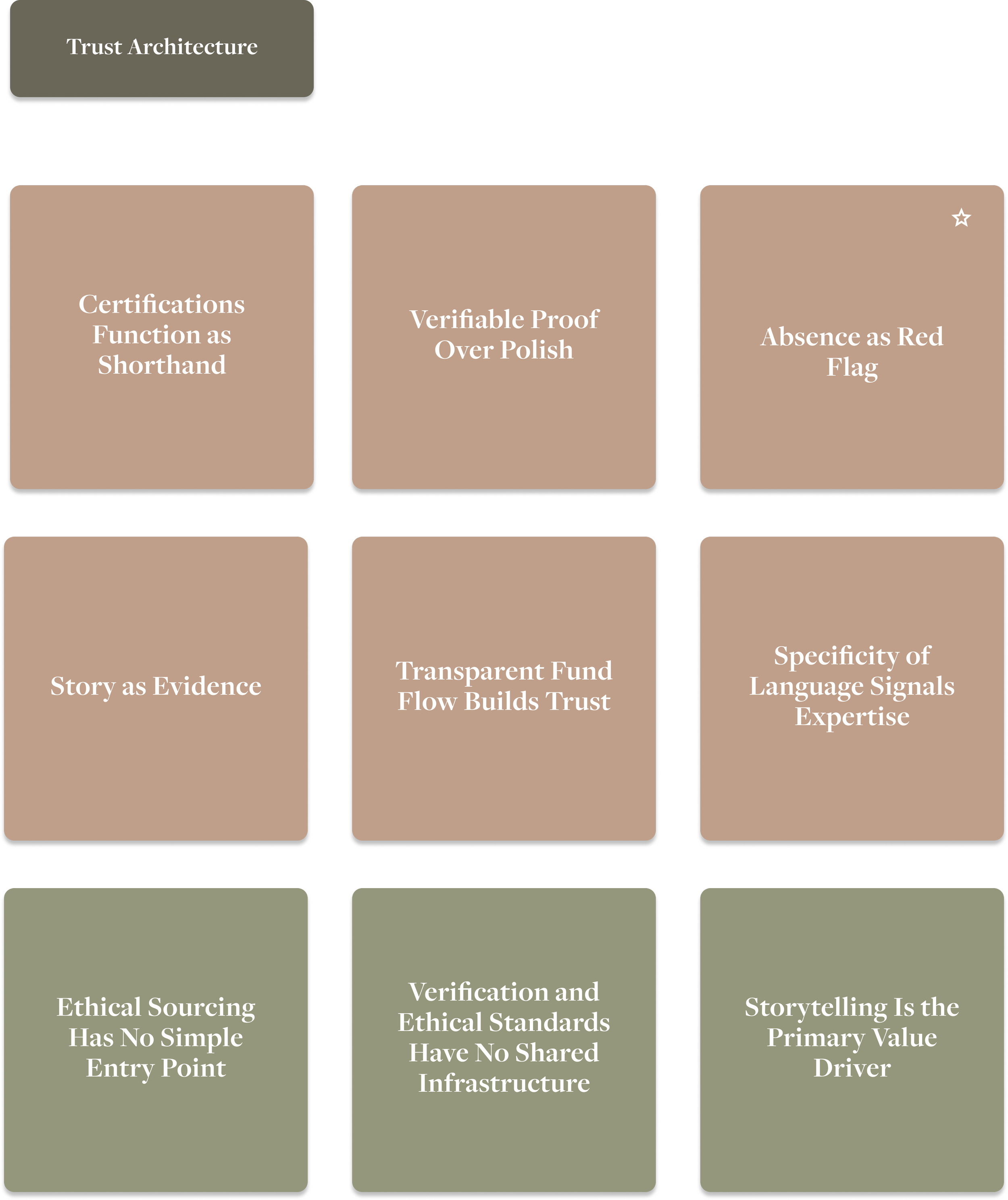
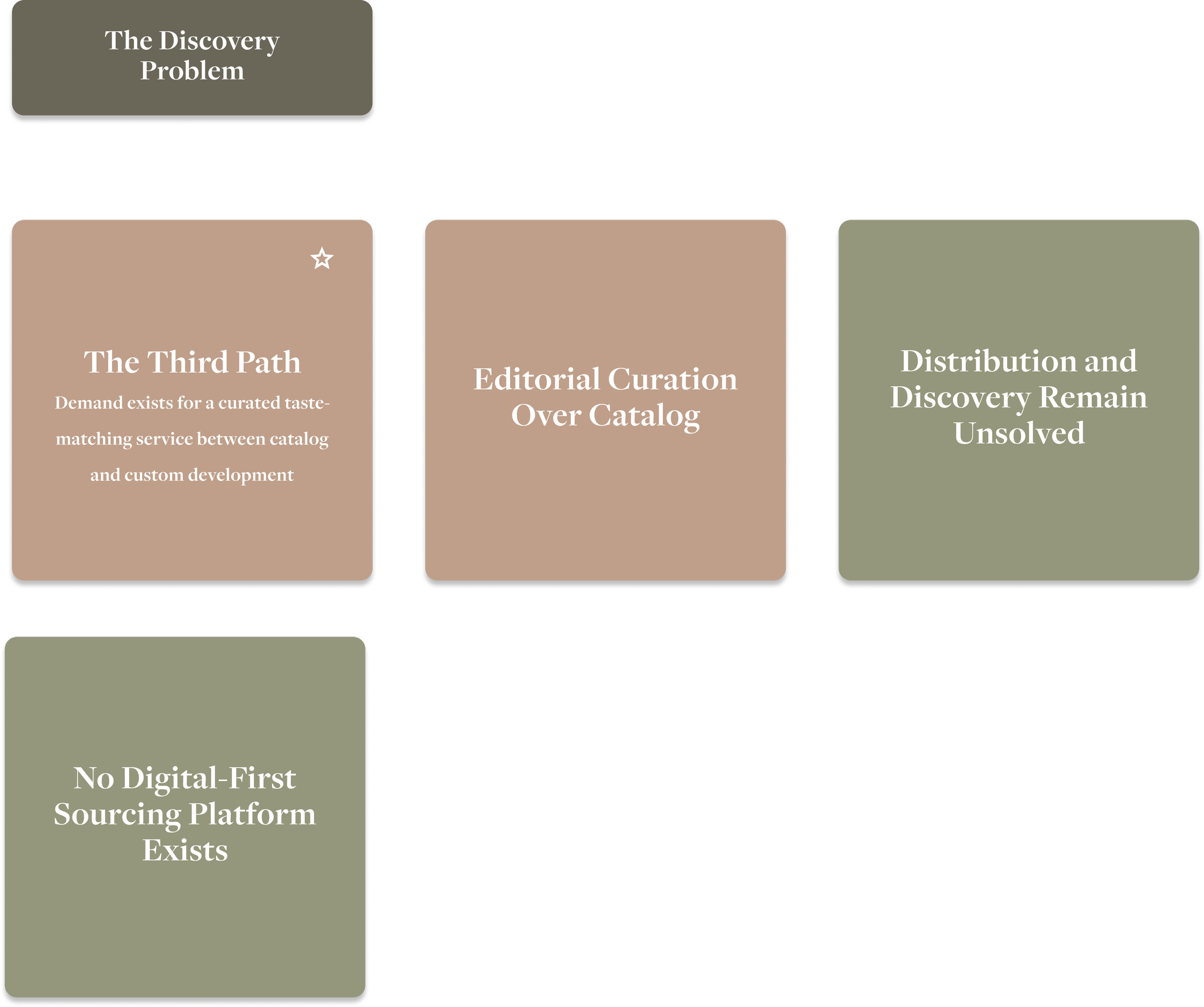
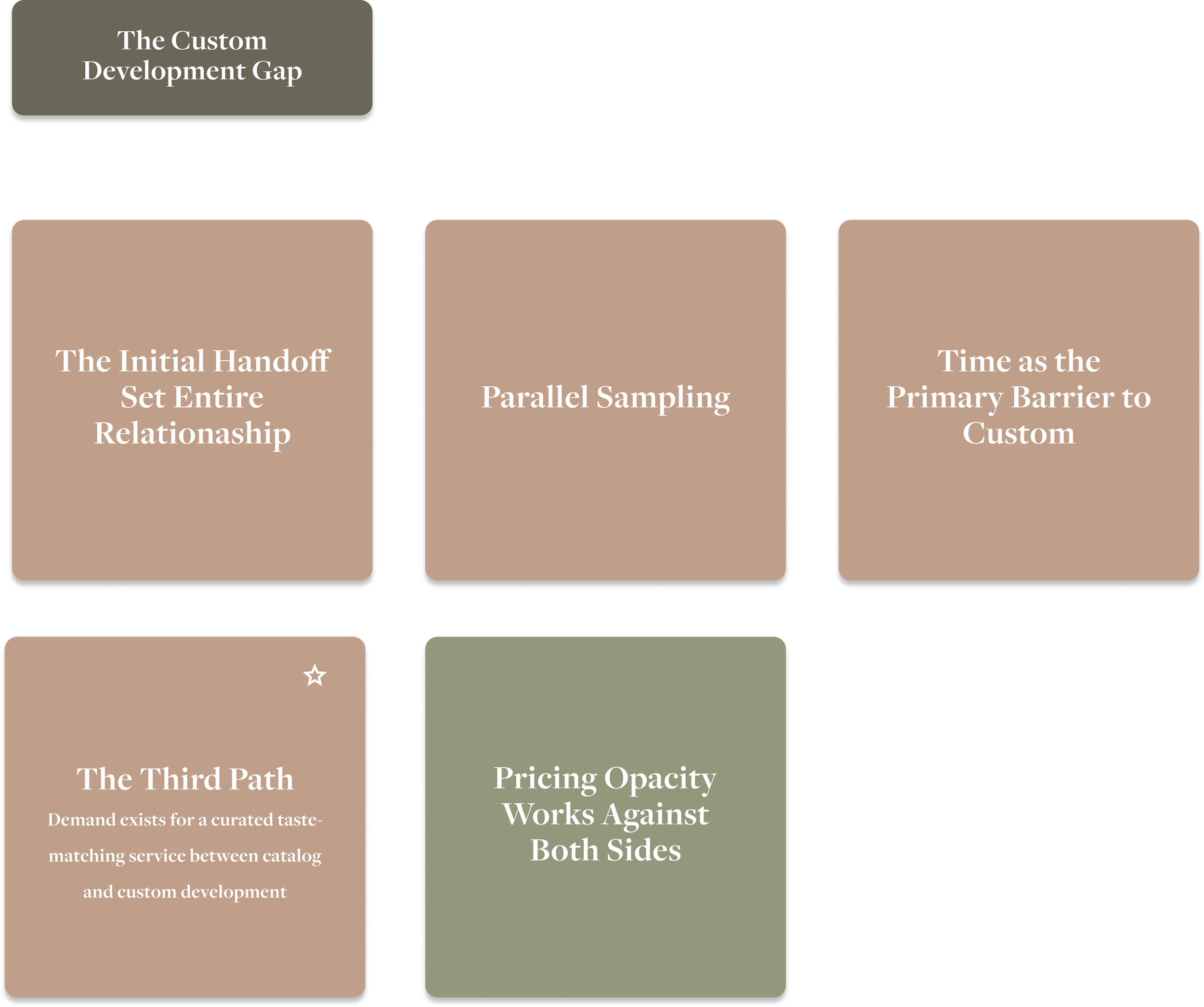
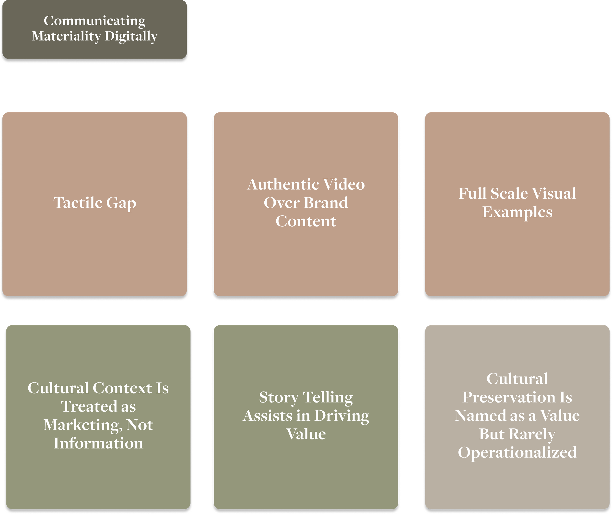
Seven themes. One overarching opportunity.
Lasso's opportunity was to be the connective layer, clear in purpose, human in presence, transparent in process.
The ethical artisan sourcing ecosystem has all the necessary components, but they exist in entirely separate organizations with nothing binding them together.
-
Organizations in this space are built around their own identity rather than the client's need
-
Clients are not lost because the platform fails to impress — but because it fails to give them enough to justify reaching out
-
The most trusted element in sourcing was a knowledgeable human presence, yet no platform made this central or visible
-
Trust is built through verifiable, specific evidence, not aesthetics or values language
-
No digital platform has solved artisan discovery at scale without sacrificing curatorial depth
-
The most desired service option in the market was also the least available
-
The inability to make something physical feel present through a screen was the most universally felt problem in the space
The trust that was already there
Lasso hadn't built the credibility problem, but it had already built some ingredients to solve it.
Founder profiles gave buyers a real person to trust instead of a faceless "about us." The artisan network was documented with real transparency, not just values language. Process detail and cultural specificity were doing quiet work throughout the site. None of it needed to be invented. It needed to be surfaced earlier, and connected directly to the moment a buyer was deciding whether to reach out.
Already Working — Network Transparency
Openness about the artisan network gives buyers something concrete to evaluate, not just a values statement
Already Working — Founder Presence
Founder profiles create an immediate, personal trust signal that generic "about us" copy can't replicate.
From existing architecture to a buyer-centered structure
The site was mapped in three versions across the project, each reflecting a different stage of the process.
Documented what existed — a lean structure that prioritized brand identity over service clarity, with no dedicated middle state between browsing and contact
01
Original site map
Reflected the research direction — an expanded How We Work page, a repositioned Stories page as a future portfolio layer, and contact designed as a destination
02
Revised site map
Incorporated founder feedback, reworking language, adjusting content priorities, and structure based on what was confirmed feasible to build and maintain
03
Post-client feedback map
Designing the How We Work page
The central design challenge was pacing.
Early concepts organized information into dense sections, participants in generative research had described exactly this kind of experience on other supplier sites as a reason they disengaged. The solution was a layered architecture.
Distributed contact CTAs
Contact entry points introduced across the experience to lower the barrier at any stage, regardless of how defined a buyer's brief is
Visual process timeline
Designed to read as a timeline immediately, without requiring orientation — numbered steps, left-to-right
Services cards at the top
Answer "do you do the thing I need?" before asking buyers to read anything — enabling fast self-qualification
Progressive disclosure
Expandable sections for depth, without forcing everyone through it. Scanning and reading modes, clearly separated
Proof before polish
Lo/Mid fidelity testing before moving to high fidelity
A five-question written questionnaire was distributed to a broader participant pool before investing in hi-fi.
10 contacted, 5 confirmed.The questionnaire covered homepage clarity, audience recognition, process legibility on the How We Work page, open feedback, and likelihood to reach out.
Homepage Clarity
4.8
/5
/5
4.8
Conversion Intent
4.8
/5
Likelihood to reach out
4.1
/5
Process Diagram
The 4.1 average reflects a page that participants found valuable but had to work harder than they should have to move through
Three specific participants flagged the same issue: the diagram was communicating what Lasso does but not guiding the reader through it clearly enough, creating a comprehension gap that was structural rather than informational.
To make the reading order unambiguous at a glance, I added numbered step indicators and reworked the text hierarchy. I quieted competing visual elements and emphasized each timeline segment for more visual clarity.
Diagram Reworked
Version 1
Version 2
Final Version
*Click image to enlarge
Seeing what the user sees
The same participant pool was brought back to walk through the Figma prototype.
Sessions covered three task flows: navigating the site to understand what Lasso does, moving through the How We Work page, and finding a way to contact Lasso from wherever they were.
What emerged was…
-
Every participant copied the email directly; form destination unclear, Apple Mail friction, no named recipient
-
All 5 participants wanted to see past work or material examples before reaching out
-
Buyers couldn't self-qualify without reaching out first — MOQs, project size, flexibility not addressed
-
"The Stories" and "Our Network" caused hesitation before clicking — architecture sound, labeling underperforming
-
Learn More read as links not expanders; timeline needed a beat of orientation; sections felt dense in places
-
Founder profiles, network transparency, process detail, and cultural specificity all contributing to credibility
A layered, scannable process page built around how buyers actually make decisions. Service cards at the top let visitors self-qualify immediately. A visual timeline makes the end-to-end process readable in seconds. Progressive disclosure keeps depth available for those who want it — without forcing everyone through it before they feel informed enough to act.
What was built — and what changed
How We Work page
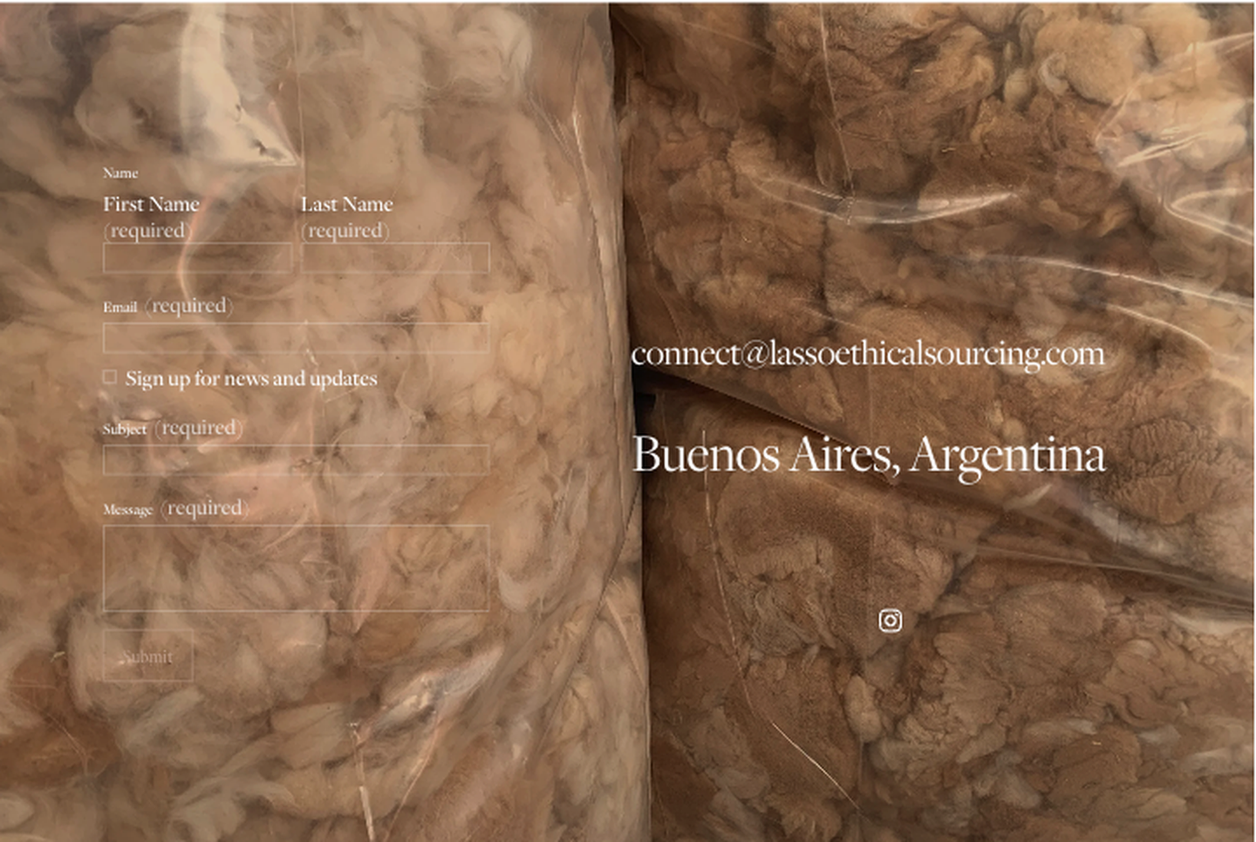
Rebuilt around what usability testing made undeniable — every participant bypassed the form and copied the email directly. The general company email was made prominently copyable, named team members with titles were added as trust and routing signals, and the form destination was explained. The tone was recalibrated throughout to feel like an open invitation rather than a formal transaction.
Redesigned contact page
Original
Revised
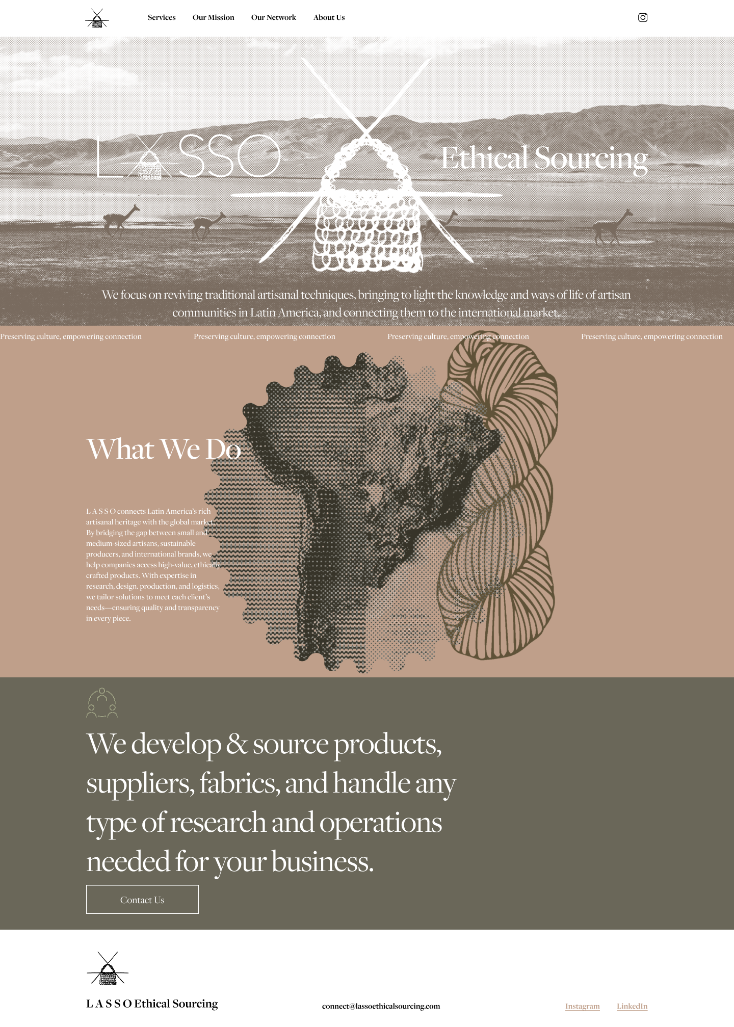
Research surfaced a consistent and urgent need: buyers wanted to know immediately whether the site was for them. The original homepage didn't answer that fast enough — the mission lived on a standalone page, and the relationship between Lasso, its artisan partners, and the client was never made explicit.
The mission page was dissolved and integrated directly into the homepage — alongside a new section articulating the three-way partnership between artisan, Lasso, and client. What had been buried became the first thing a buyer saw.
Homepage restructuring
Original
Revised
Rather than leaving buyers to navigate on their own after landing, the CTA structure gave each audience a clear next step from the moment they understood where they fit — reducing the gap between arrival and action.
This was just the start
There were still gaps across both rounds of research, the most consistent being the absence of a catalog or portfolio layer. Buyers wanted to see past work and material examples before reaching out — and the Stories page is the natural home for this content.
Develop the Stories page into a browsable portfolio organized by category or material — giving buyers something tangible to reference before writing their first email
Portfolio / Catalog Layer
Scale & Flexibility on How We Work
Add information addressing MOQs, project size, and flexibility so buyers can self-qualify without needing to reach out first
Navigation Label Refinement
Test alternative labels for The Stories and Our Network that more clearly signal case studies, artisan community, and material
Lasso has spent years earning trust the old-fashioned way — through relationships, cultural knowledge, and craft. This project made the case that the site could carry that same trust digitally: not by explaining more, but by explaining just enough, at the moment a buyer needed it, to feel confident reaching out.
Meta Data
Lasso Ethical Sourcing
Client
UX Research · UI Design
Role
5 Weeks
Timeline
Website UX Research & Redesign
Type
Figma, Claude