Art21
Reframed
Art21: Reframed is an end-to-end iOS native app concept for Art21, who holds one of the most significant free archives of contemporary art documentary film in the world, without a mobile experience worthy of it.
The audience finds the content sideways through YouTube and Instagram, loses it easily, and has no reason to return. The solution was not a navigation redesign but the introduction of an editorial voice on mobile, giving Art21's archive a home that finally matches the quality of what it holds.
Art21 and the problem worth solving
Art21 is a US-based nonprofit founded in 1997 and headquartered in New York City. Its mission is to expand access to contemporary art through documentary film — free, rigorous, and built around the belief that living artists and their ideas deserve a wide audience. Over 25 years it has produced four distinct series spanning PBS broadcast, short digital films, and longer-form international profiles. Every film is free to stream. No paywall, no subscription, no barrier beyond finding it.
That last part is where the problem begins.
Homepage — Visually nice, but throws you into Art21 with no real orientation
Artist Directory — Endless scroll with no visual identifiers
Explore Page — Only allows you to view one pre-determined category at a time
The content is trusted. The container isn't.
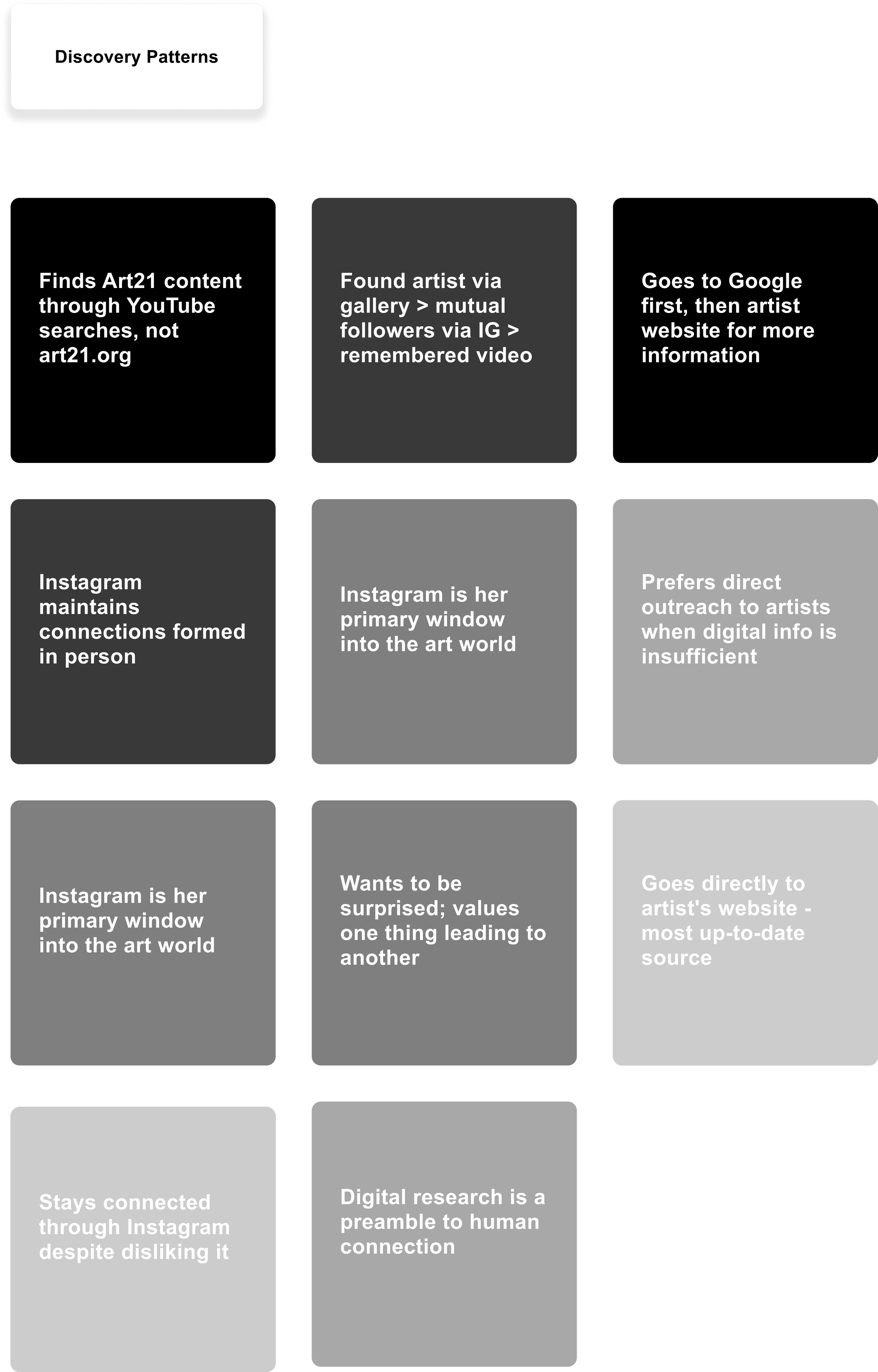
Before a single interview was conducted, a pattern was already visible. Art21 has a significant presence on YouTube and Instagram. Its films surface regularly in feeds, in search results, in shared links. People encounter them, watch them, and value them. But ask those same people where they watched it and most of them won't say Art21. They'll say YouTube. They'll say someone sent it to them. They'll say they saw a clip somewhere and followed it back to, they're not sure where exactly.
The brand recognition gap is real. Art21's content reaches its audience constantly. Art21 as a destination does not.
"I know of Art21 but it's like — damn, I kind of forgot about it. I feel like no one knows that it's Art21. They just think it's random videos."
— Usability test participant
This is the trust gap. The films are trusted. The platform is not yet a place people go to intentionally. And when they do arrive (most often by accident, through a link or a recommendation) the mobile experience gives them nothing to hold onto. No editorial voice to orient them. No curatorial logic to guide them. No reliable way to save what they find. The experience places the full burden of navigation on the user while offering nothing to respond to.
The result is an audience that finds Art21 sideways, loses it easily, and has no reason to return.
Five people, five ways of moving through the art world
The research was built around five participants, artists, designers, and curators with an active relationship to contemporary art, whether through making, teaching, or simply following it closely. Each was interviewed remotely, combining a qualitative conversation with a live mobile usability test of Art21's existing site.
Across five participants, there was a spread from 3 to 8, reflecting meaningfully different relationships to the platform and five distinct modes of engagement.
Session rating
Session rating
Knitwear Designer
Editorial Illustrator
Session rating
8
/10
Curator & Arts Educator
Session rating
7
/10
“ I guess I would just keep it open on my phone tab”
Textile Artist & Designer
8
/10
“Explore needs to be less exploratory & more direct”
Multidisciplinary Artist
5
/10
“ I felt like you already needed to be in the know”
3
/10
Session rating
“ I think it’s crazy they don’t have an app”
“I like it — the full screen video, I like it”
Surfacing vs. Housing
Before speaking to participants, three platforms were analyzed to understand the landscape Art21 sits within.
Louisiana Channel validates the content model and shares the same mobile gap. YouTube is already functioning as Art21's de facto mobile interface, it can surface a film but it cannot give that film a home. MUBI is the design benchmark, a platform that has solved how to make a large archive of culturally serious content feel intimate, navigable, and worth returning to.


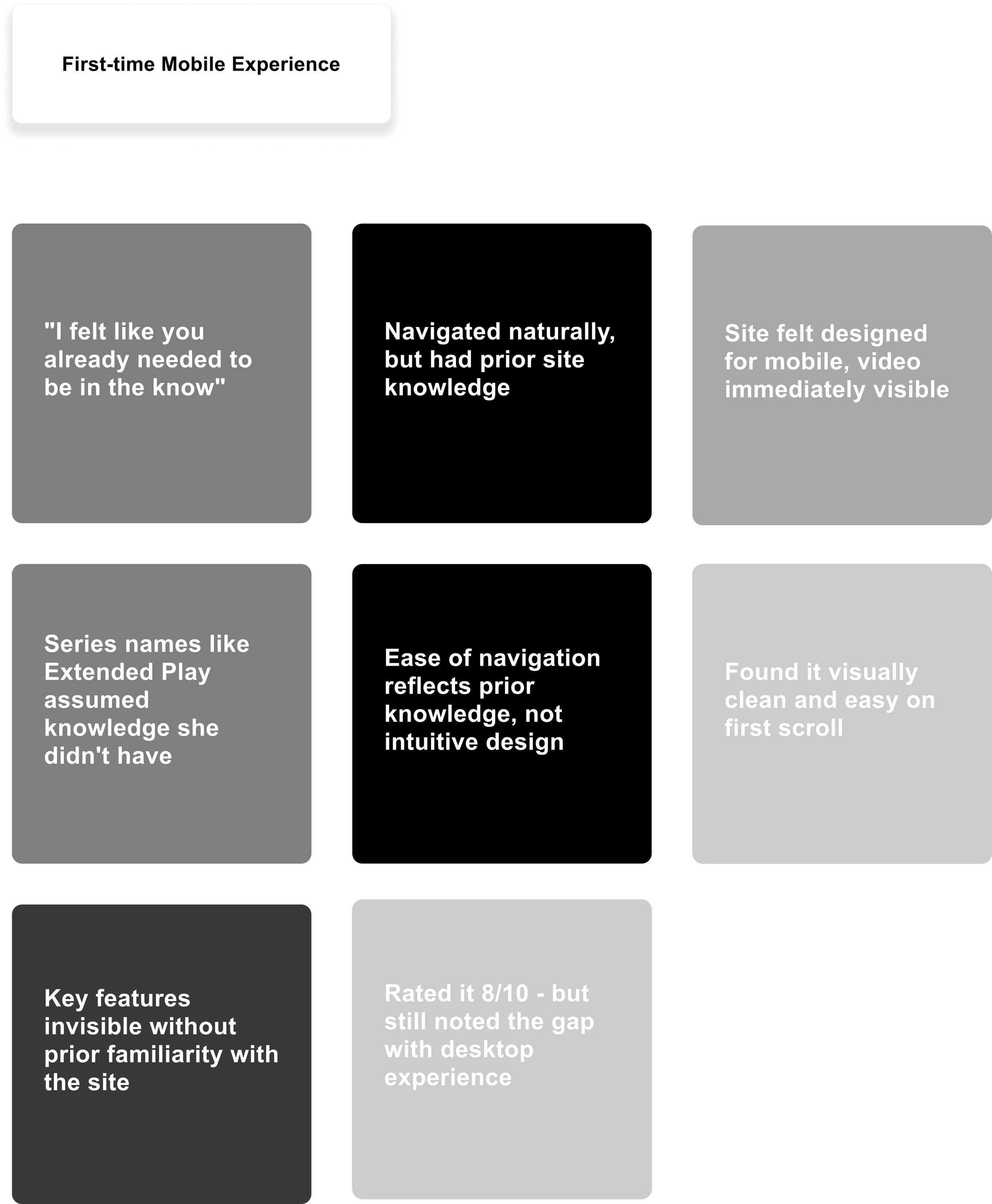
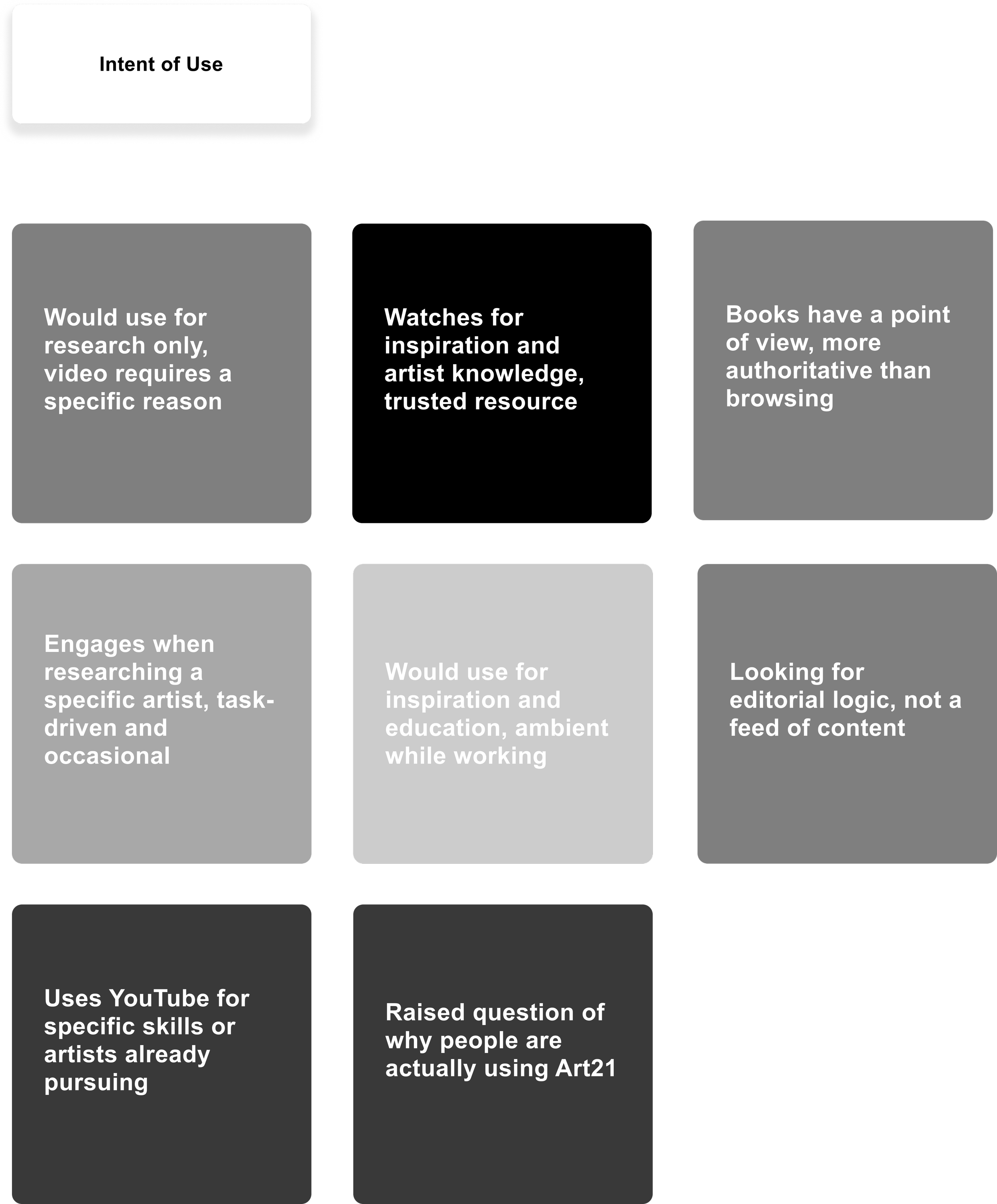
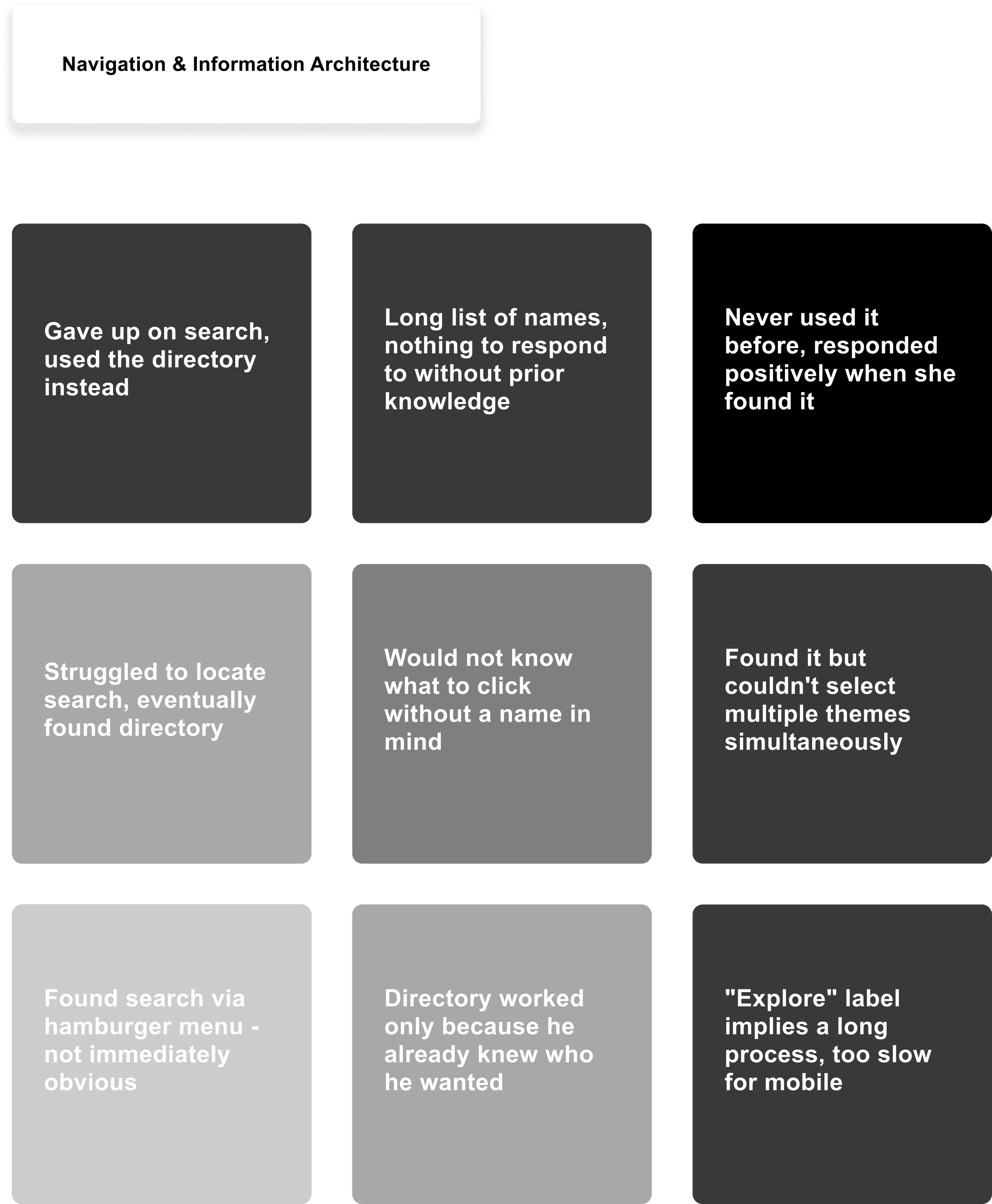
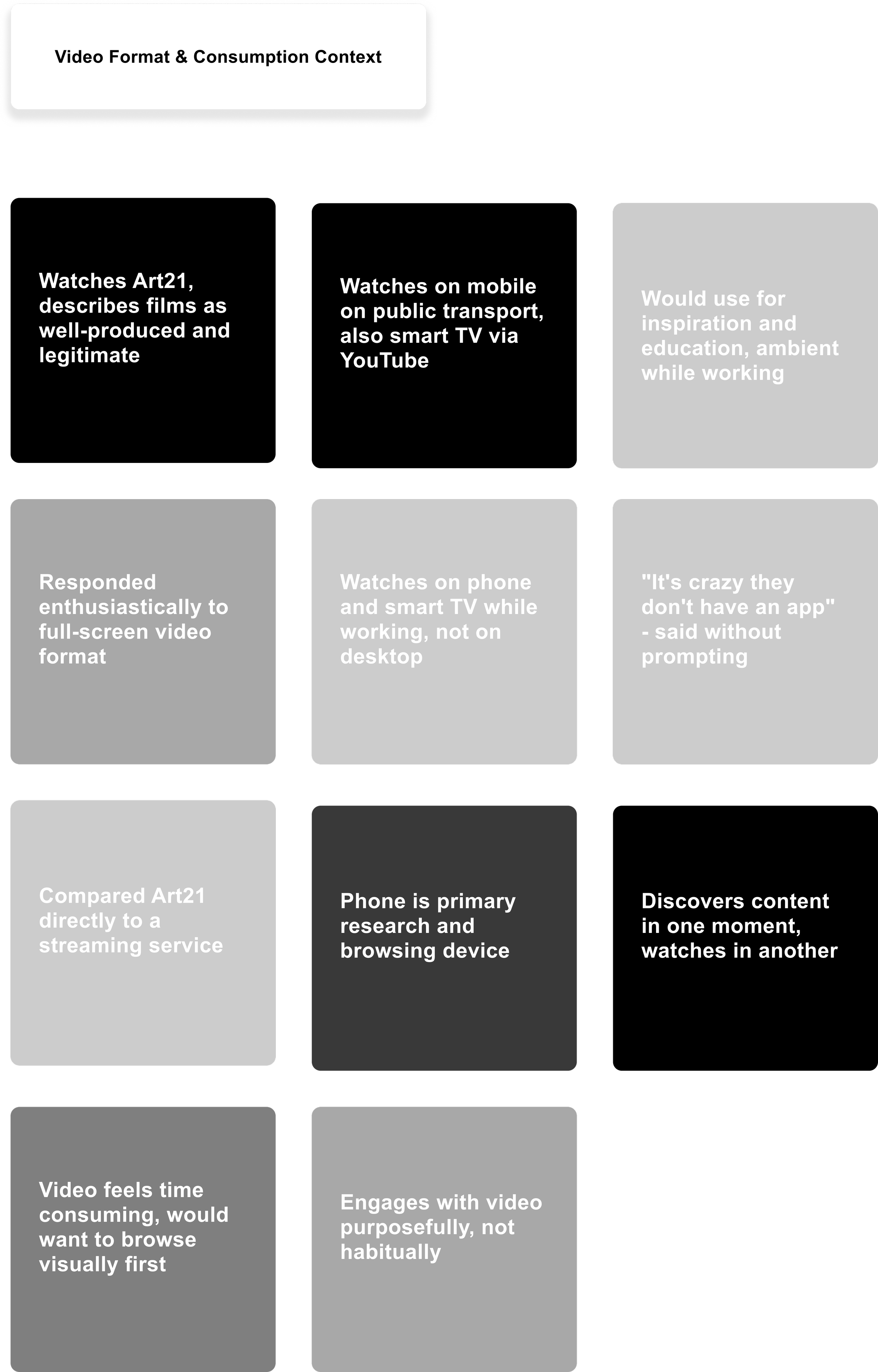
Six themes were consistent across the sessions
-
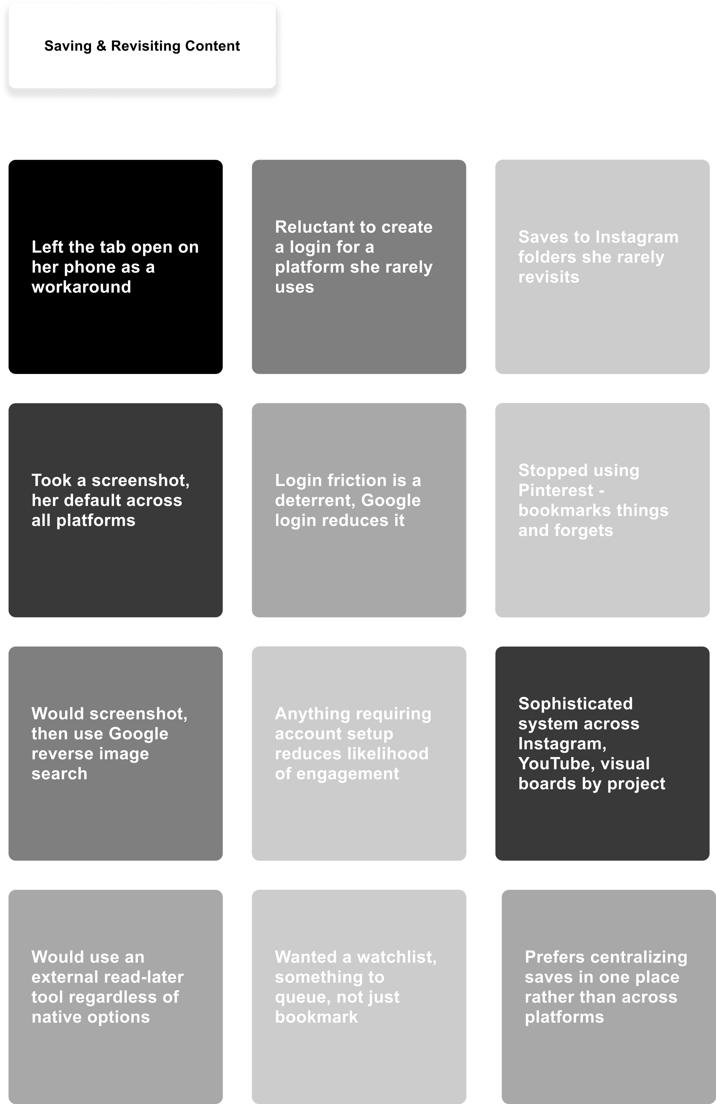
Every participant had a workaround. A tab left open. A screenshot taken. A folder that never gets revisited.
-
Search was buried, the directory was name-only, and the architecture consistently rewarded familiarity over curiosity.
-
Insider language and the absence of any welcome mechanism left first-time visitors stranded.
-
Not one participant described finding Art21 intentionally. It always happened sideways.
-
Participants valued the films and found them through YouTube. They didn't think of them as being from Art21.
-
Five participants, five meaningfully different modes of engagement.
What the research kept saying
Six themes. Five participants. One consistent direction. The research didn't point toward a navigation redesign, it pointed toward something more fundamental.
Art21 had never built an experience for the person arriving at it for the first time, on mobile, with no prior knowledge and five seconds of patience. Understanding who that person was became the foundation for everything that followed.

Sophie is a composite of all five participants, a practicing artist or designer whose relationship to contemporary art is ambient rather than deliberate. She stays receptive rather than actively searching, letting a curated Instagram feed, a mutual follow, or a YouTube search surface what's relevant. She trusts what Art21 produces but arrives at it sideways, through other channels. What she values most is the feeling of one thing leading to another, discovery that moves forward on its own logic, not because she went looking for it.
One thing, done exceptionally
The research made the direction clear. Not a navigation redesign. Not a utility app. Something more considered, a mobile platform that gives Art21's archive an editorial voice, and in doing so closes the gap between the quality of the content and the quality of the experience that delivers it.
The answer was curation as a product.
A weekly curated film is the primary editorial anchor, one film per week drawn from the full archive, chosen and framed by Art21's curatorial team. A vertical editorial scroll feed sits below it for ambient discovery. The Discover tab lets users build a personal collection by selecting themes, mediums, and narratives — results populate in real time. Search is accessible within one tap from anywhere. Artist profiles lead with the work before any biography. Saving requires no account, no login, no friction
From a notebook to a native app
The design began with a pen and a notebook. Before any screen was opened in Figma, the structure of the app was worked out by hand. What does a user see first? Where does the navigation live? How does the Discover tab communicate what it does without instruction?
Not precious. Just thinking on paper.
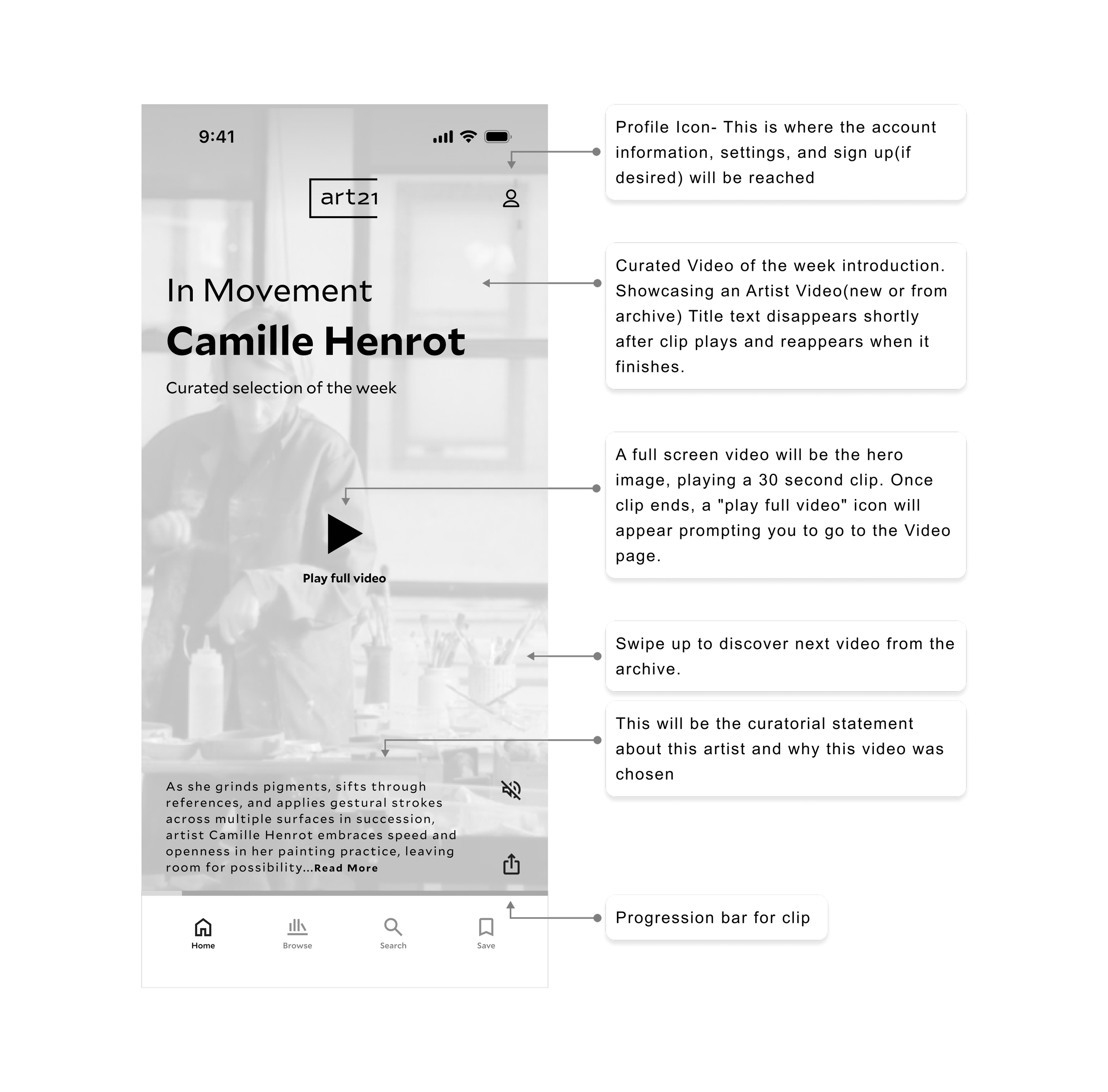
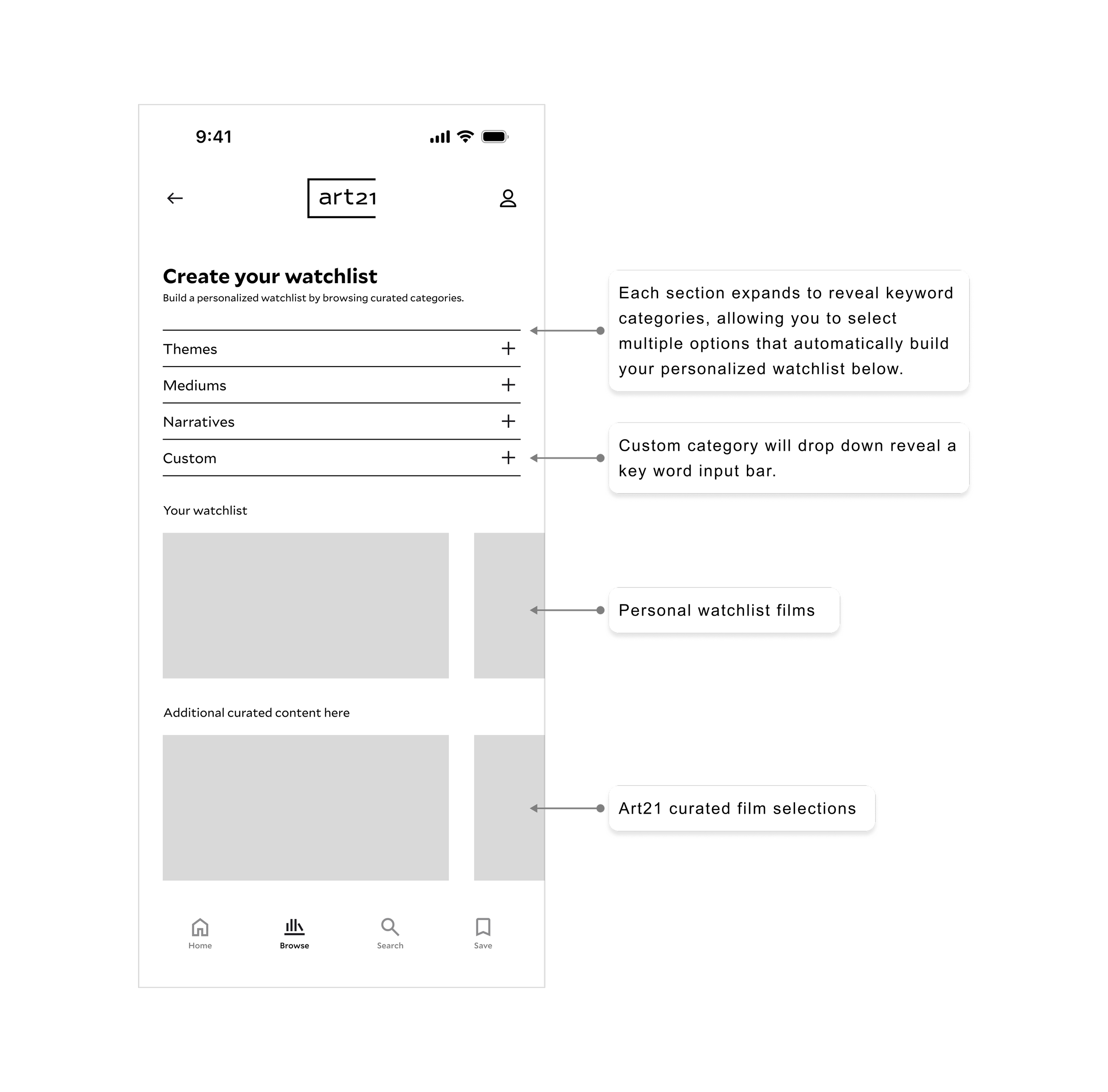
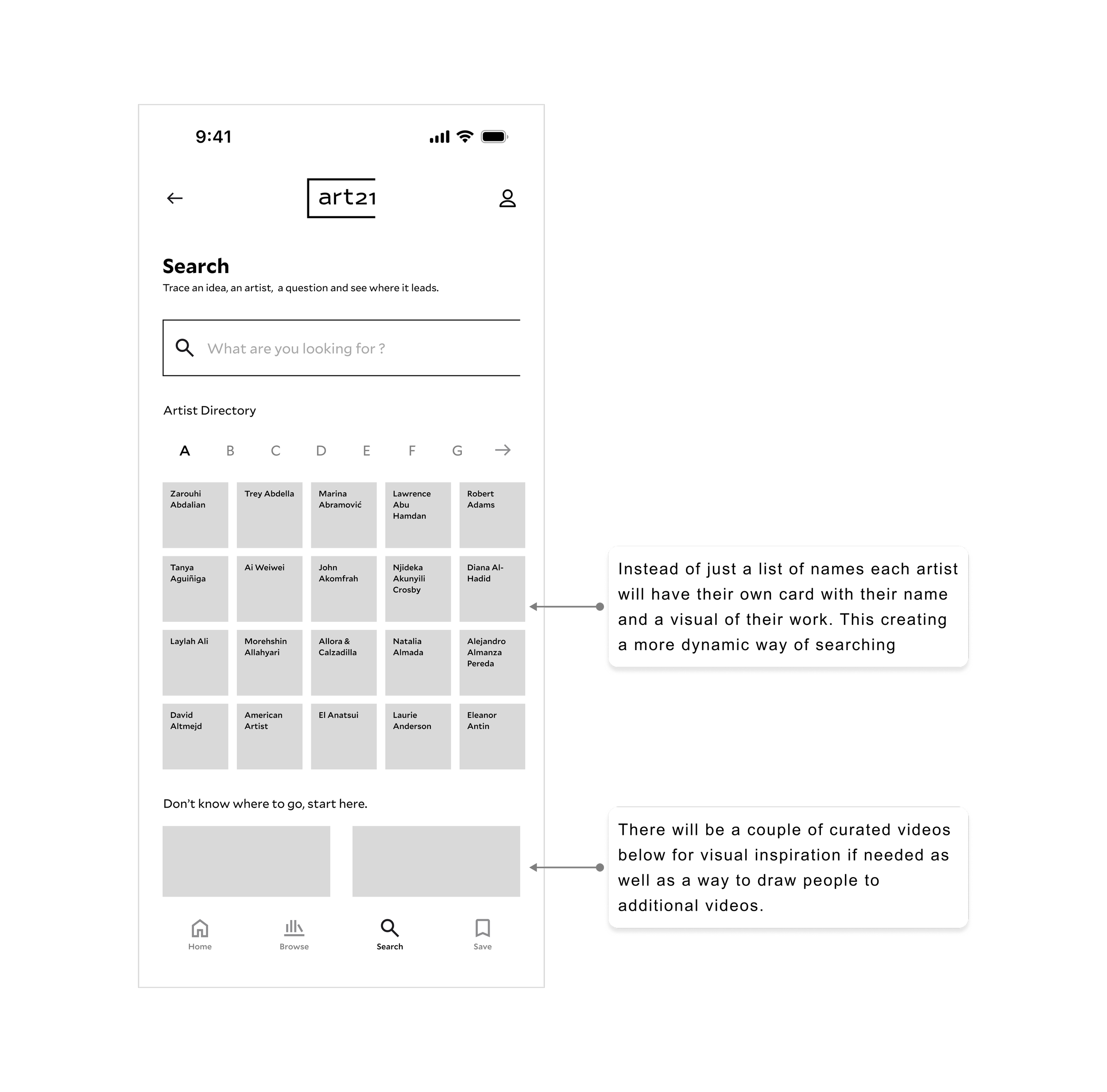
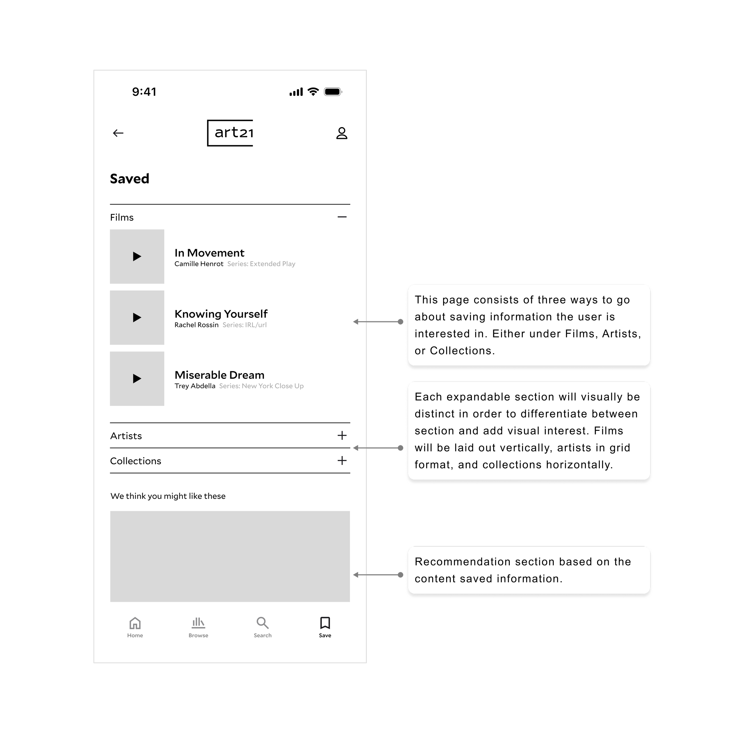
From the sketches came the mid-fidelity wireframes — still on white, still without real content, but beginning to establish the structural decisions that would carry through to the final screens. The first round of lo-fi testing validated the structural direction and surfaced two issues before high fidelity: the distinction between a personal watchlist and a curated collection, and the unclear content scope on the home screen. Both were addressed before a single hi-fi screen was created.
The first draft
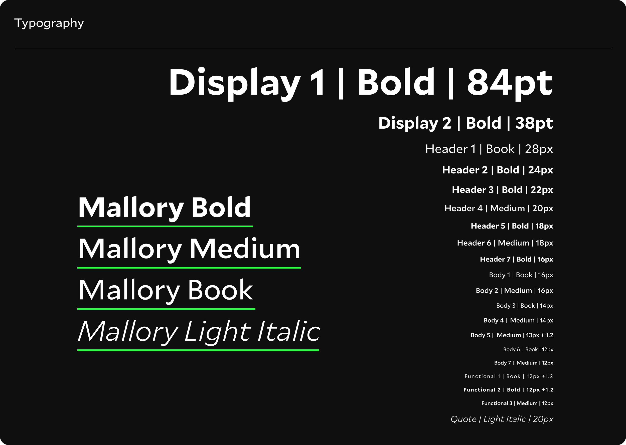
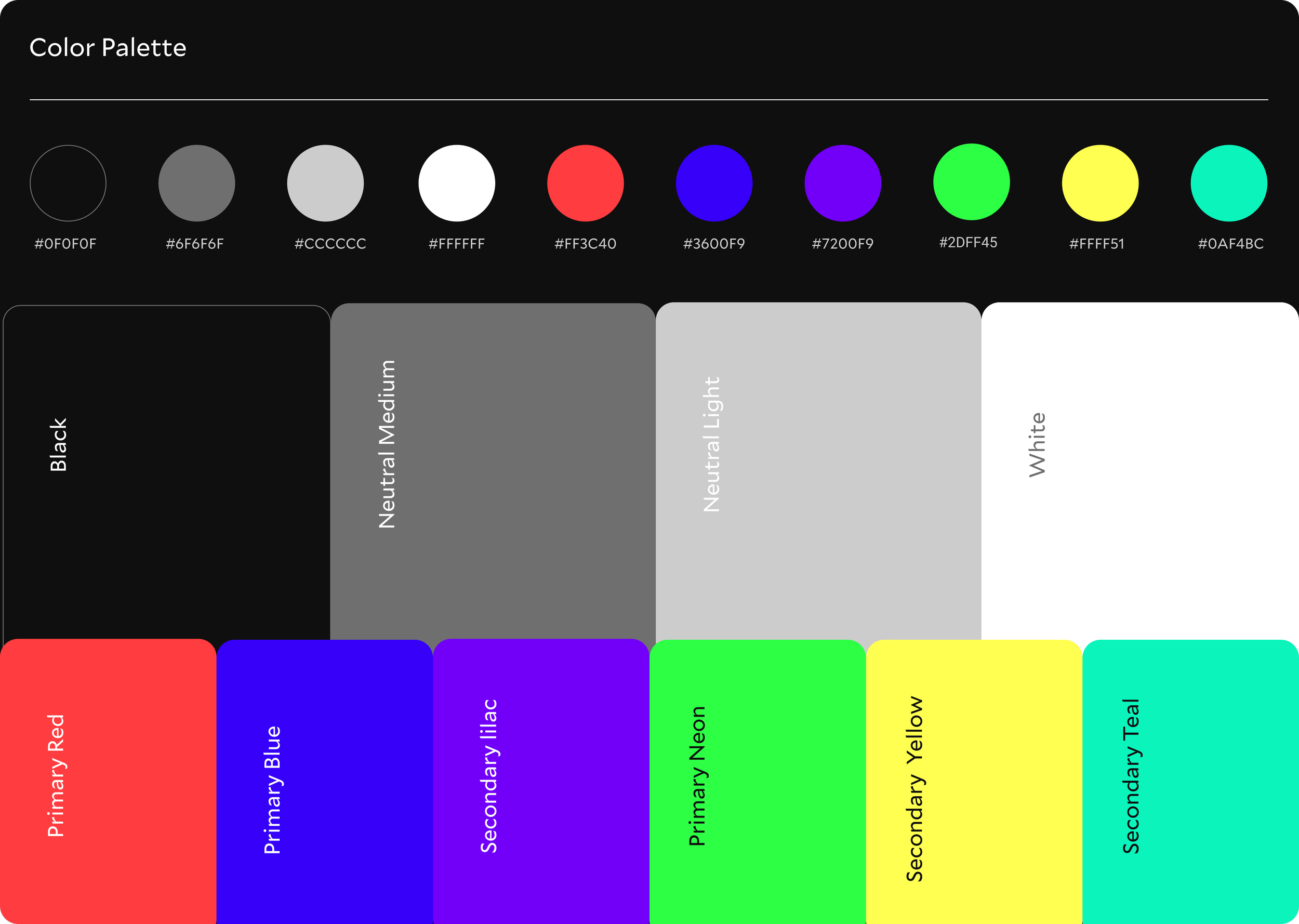
The first round of hi-fidelity screens established the visual language. Art21's existing brand — the Mallory type family, the dark editorial palette, the four series colors — was carried directly into the app. The decision was deliberate. Art21's visual identity is strong. The problem was never how it looked. The problem was how it worked.
The four primary screens showcase a shift from trying to include all of Art21's offerings to building a focused, curated, and searchable hub for discovery.
What two rounds of testing found
Testing happened in two rounds. A lightweight five-question lo-fi questionnaire with five participants validated the structural direction early. A moderated usability test with five participants navigating a Figma clickable prototype across three task flows confirmed what was working and surfaced what needed to change.
4.4
/5
Average rating across all tasks and participants in the hi-fi usability test
5
/5
Every participant completed every task. No exceptions.
4
/5
Participants confused by the same collection mechanic — identified, iterated, resolved
The Home screen, Search tab, and save action all performed well. The visual artist directory was praised for making Search feel browsable rather than purely functional. The full screen horizontal player was validated as the right format without exception.
Four patterns emerged consistently enough to act on.
Save Icon — Consistent hesitation
Four of five participants found the download icon before the save icon. Four different reasons, the same result.
Ambiguity in Collection save mechanic
Four of five participants were uncertain whether they were saving a whole collection or an individual film. It appeared in the lo-fi questionnaire and again here.
Builder concept right. Expand-and-push behavior wrong.
Every participant understood what they were trying to do. The friction was structural, not conceptual. Selecting a category caused the dropdown to expand, hiding the populated builder underneath.
Accessibility — Non-negotiable
For a free, public-facing organization whose mission is expanding access to contemporary art for everyone, an inaccessible experience is a contradiction in terms.
Four iterations, one direction
The usability test produced four findings. Each had a specific, actionable solution. None required reconsidering the design direction, they required finishing it properly.
-
When a dropdown section expanded it pushed the personal carousel out of view, making the real-time population mechanic invisible at the exact moment it needed to be seen. The vertical dropdowns were replaced with a horizontal tabbed selection mechanism. The personal carousel remains visible and updates in real time as selections are made. Active selections populate as dismissible tags above the carousel. A simple X at 50% opacity on each film card allows editing without cluttering the screen.
-
Two groups of icons — Share and Save in the upper right, Trailer and Download under the hero image, created consistent confusion. The Trailer button became a film icon labeled Preview. The Download icon was clearly labeled Download. Labels were added to Share and Save, now consistent across all secondary pages so users encounter the same language regardless of where they arrive first.
-
Users couldn't tell whether they were saving a whole collection or an individual film. The selected category tags were made visible directly beneath the "Your Personal Collection" header, so users could see exactly what was driving the content populating below them. A clearly labeled button reading "Save collection" was added, paired with a confirmation state that names exactly what has been saved. No ambiguity at either end of the interaction.
-
Art21's mission is to expand access to contemporary art for everyone. An inaccessible experience is a direct contradiction of that mission. Font sizes were audited and corrected across the board. Two of Art21's four series colors fall below WCAG AA minimum contrast at small sizes on a dark background. The solution shifts series label text to medium weight white (AAA compliant on black) with a prominent color underline preserving the series color-coding system. On smaller cards where space doesn't allow for text, the underline alone signals which series a film belongs to.
The design system and final screens
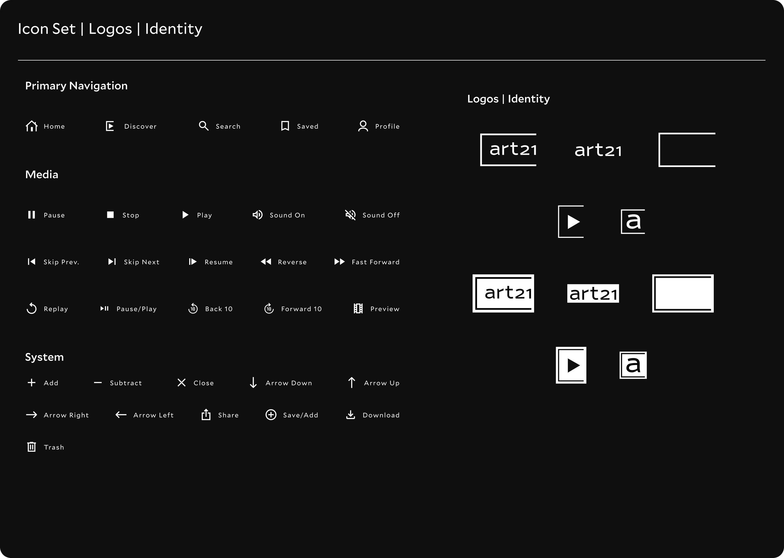
Before the final screens were built, a full UI kit and component library was established in Figma. Not as a formality — as a foundation. The Mallory type family carried across four weights. The palette built on black. Art21's four series colors preserved through the underline system. Every repeating element documented and built to accommodate the content it holds.
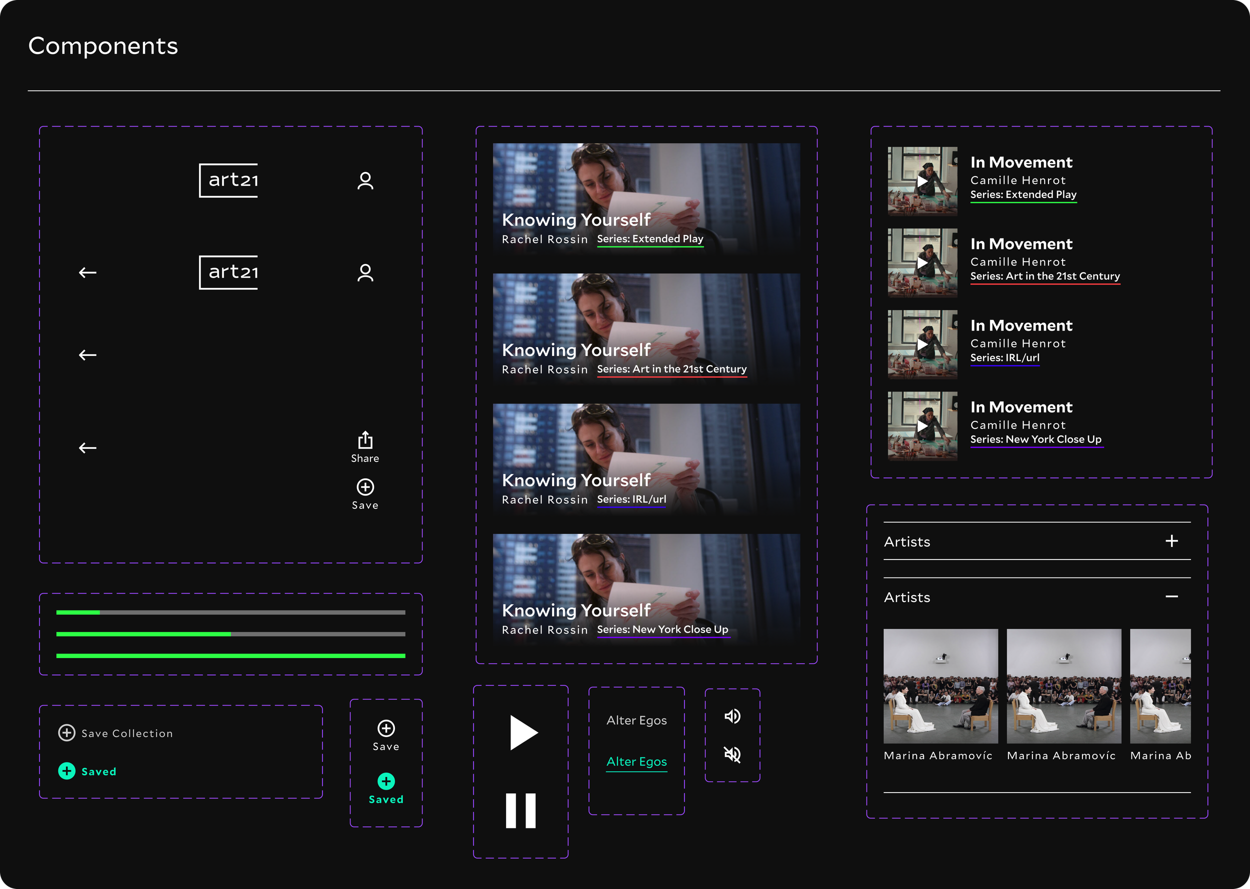
The final screens
Four primary tabs. A weekly curated film waiting on arrival. A Discover tab that builds a personal collection in real time. A Search screen that makes 250 artists browsable rather than searchable. A Saved tab that holds everything worth coming back to. And beneath all of it — an archive that has existed for 25 years, finally with a mobile experience worthy of what it contains.
Home Screen & Film Page
Discover Screen
Search Screen & Artist Page
Save Screen & Collections Page
The work continues
This project set out to answer one question: does Art21's archive deserve a better mobile experience than a browser tab? The research, the testing, and the two rounds of iteration all point to the same answer. It does. And the audience is already there — they have been finding the content for years. They just haven't had a home to find it in.
The MVP is ready for development. Three opportunities remain for a future version.
The save action was validated across both rounds of testing but the Saved tab as a screen users navigate to and explore was never formally tested. Confirming that saved content is findable and organized intuitively is the most immediate next step.
The Saved tab as a tested destination
Custom collection naming
Users want to name their own collections rather than inheriting the tag label from the builder. The infrastructure is there. The interaction needs a further iteration to feel as personal as it should.
A recommendation layer
The existing tagging system that powers the Discover builder could surface film recommendations based on what a user has already saved — one thing leading to another, exactly as the research described.
Art21 has spent 25 years making the case that contemporary art belongs to everyone. This project makes the case that their archive deserves a mobile experience that reflects that ambition, one that meets the audience where they already are, gives the content a home worthy of it, and makes one thing leading to another feel like the most natural thing in the world, not even realizing it's happening until you found what you didn't even know you were looking for.
Meta Data
Art21
Client
UX Research · UI Design
Role
5 Weeks
Timeline
End-to-End mobile app design
Type
iOS Native App Concept
Platform
Figma, Claude